
Pizzeria Redesign
Pizzeria UX Re-design
A full-fledged UX project on re-designing a pizzeria website to make it usable so as to enable easier and faster order placement
Background
This is a full-fledged user-centric re-design project for a local pizzeria website.
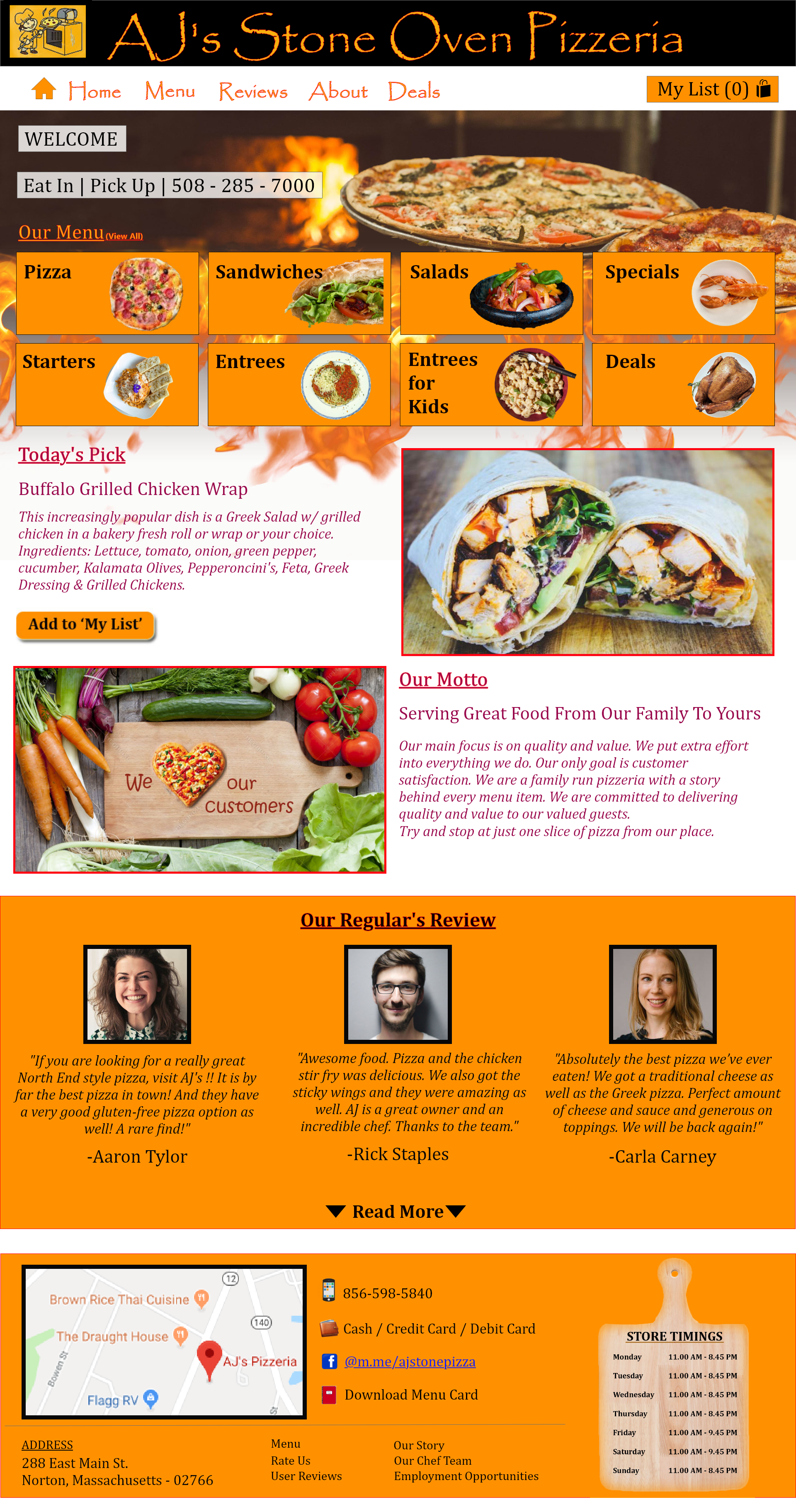
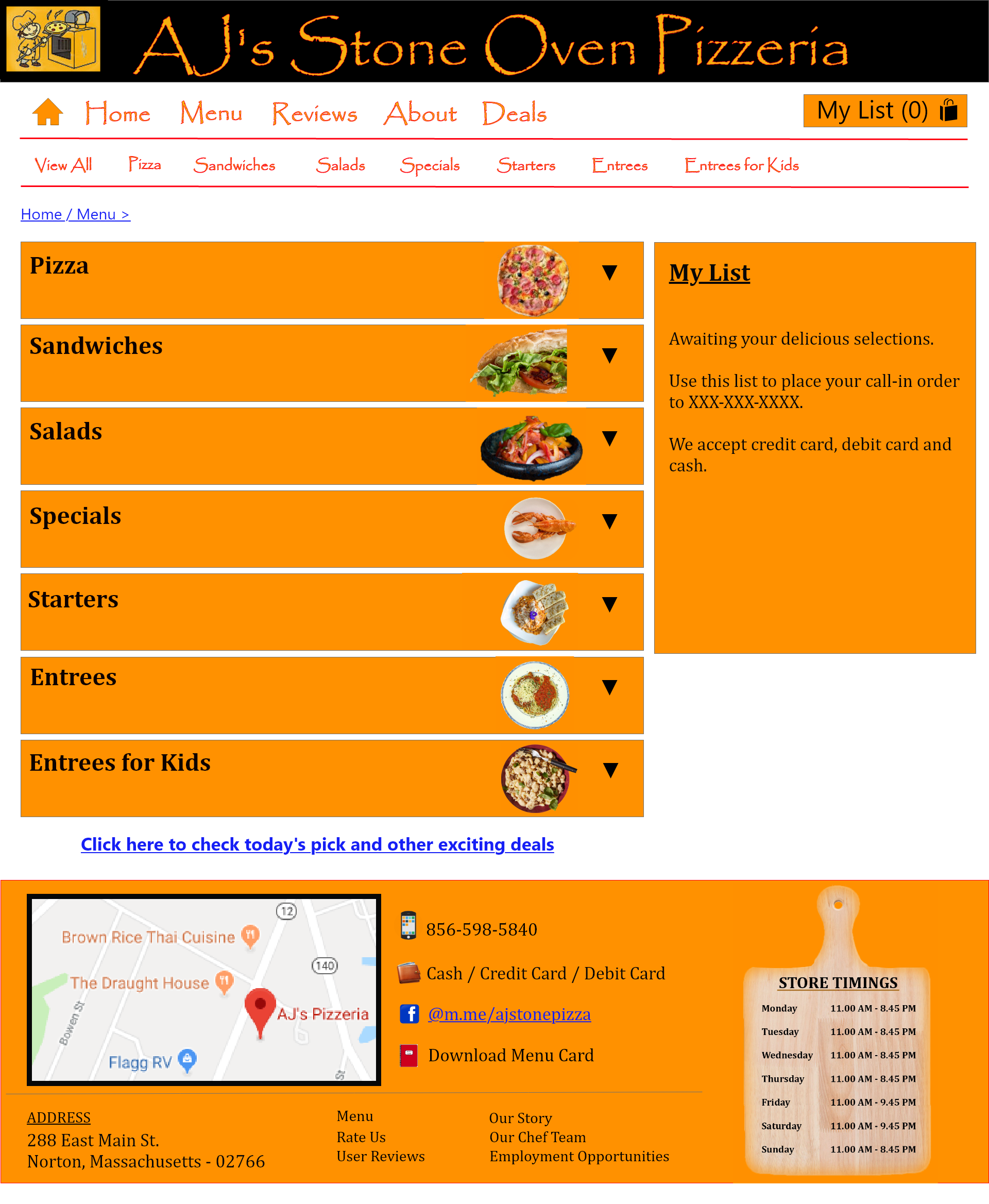
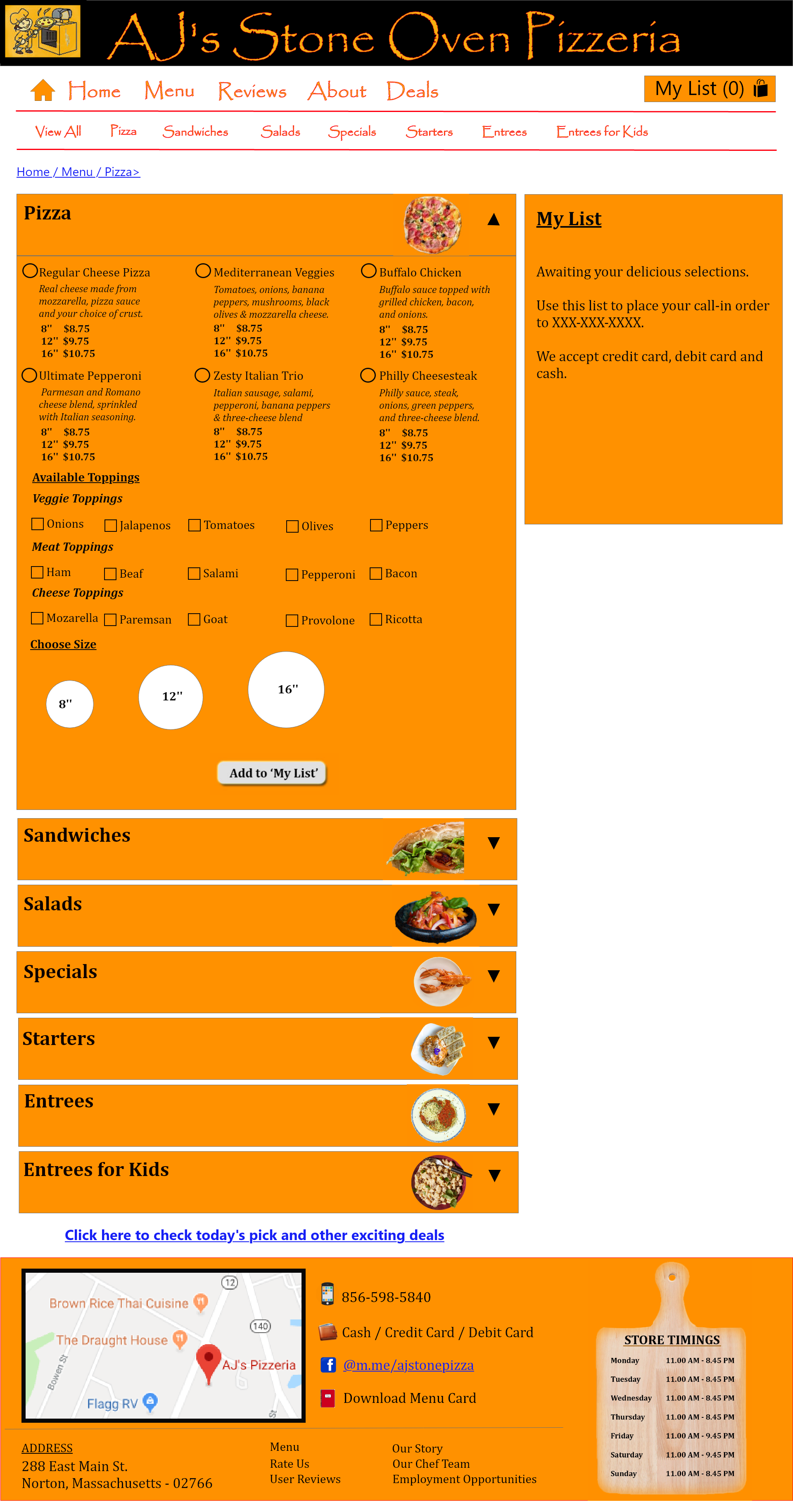
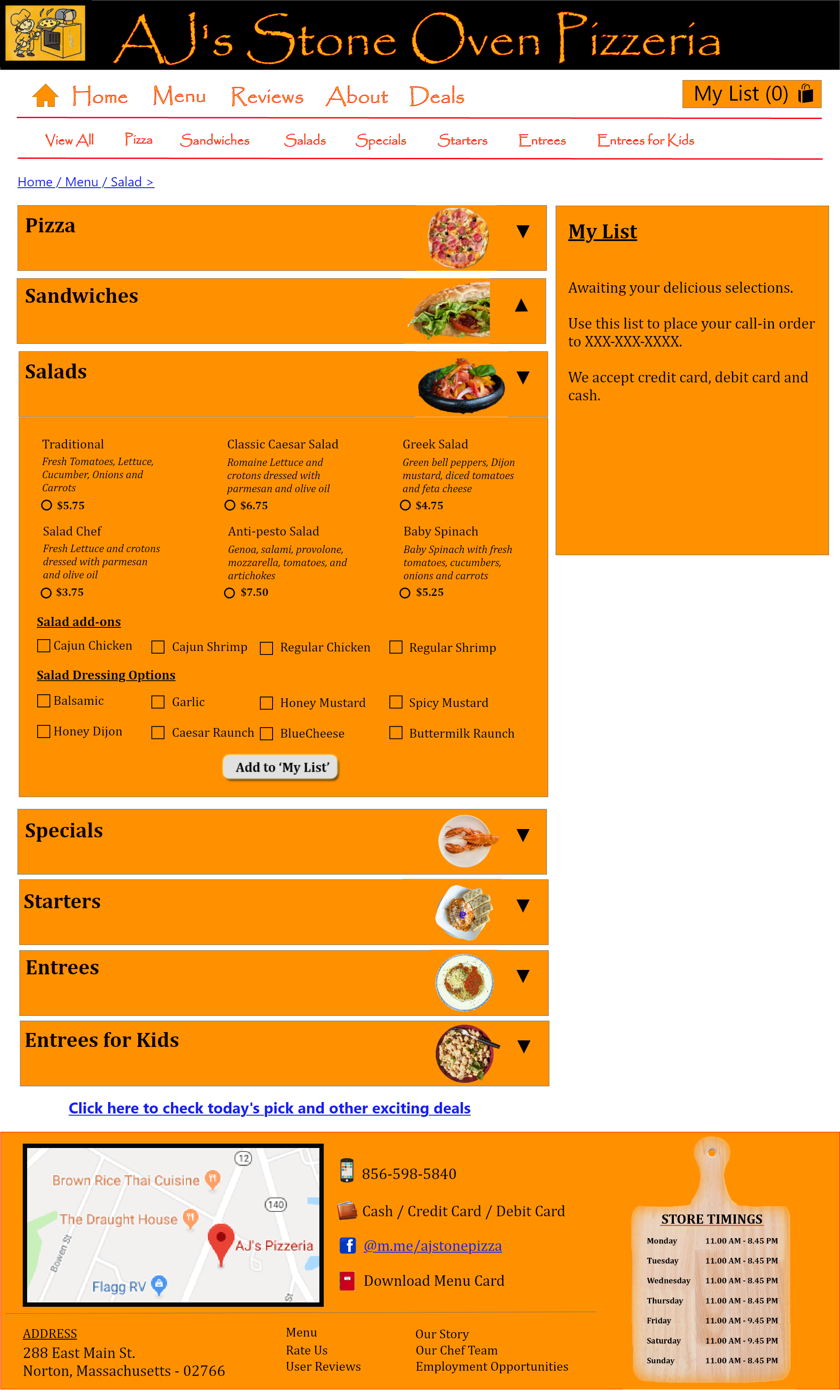
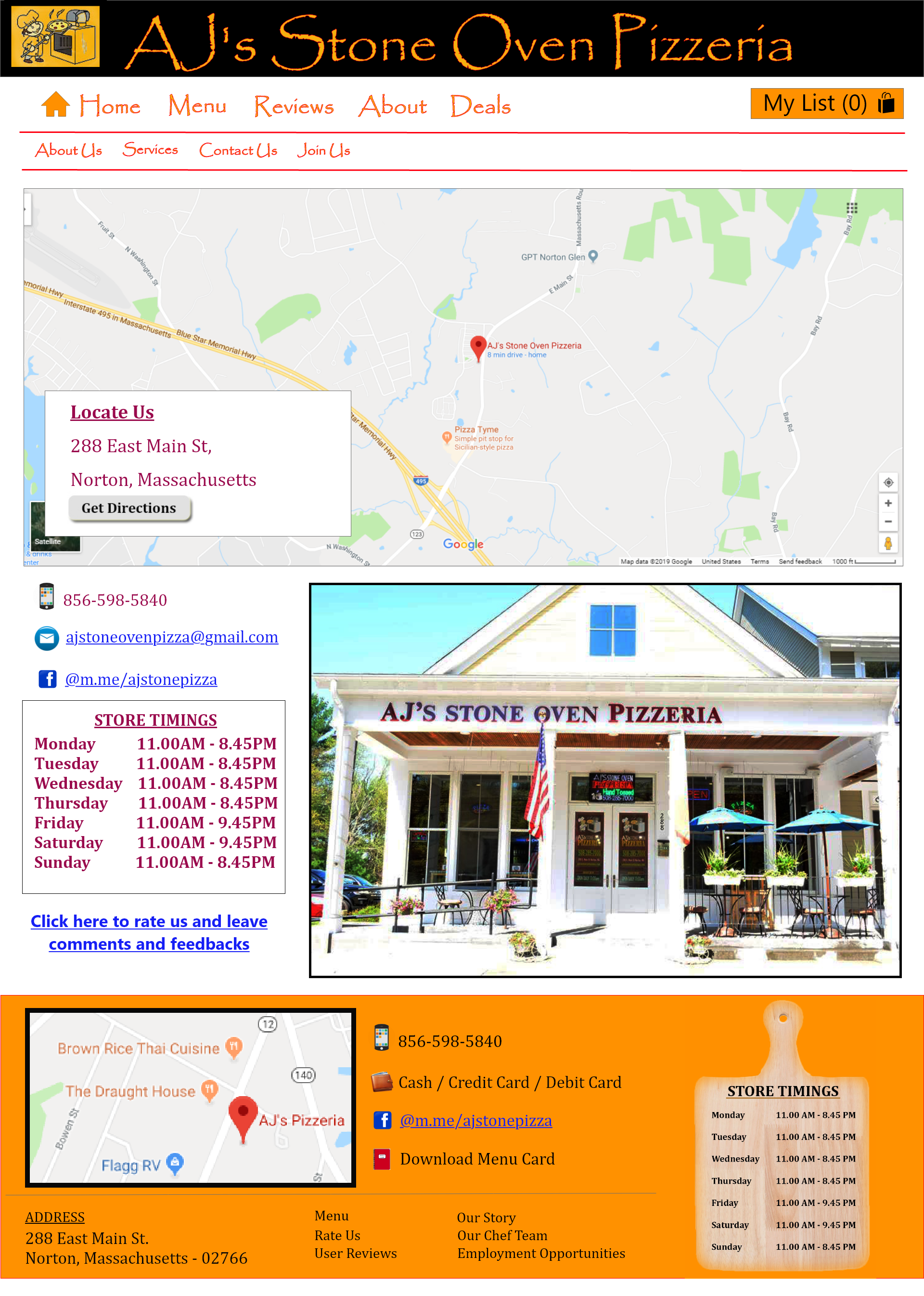
The existing pizzeria website, as can be seen here has been built with the bare essentials that reflects just like a marketing flyer rather than like a proper online website. The website carries the restaurant's menu card that again displays only the basic random details that serves as a mere business card. It offers no scope of short listing items, or comparing prices, to be able to place an order in an organized manner. These entire shortcomings called for a user-centric re-architecture of the website.
The re-design is intended to improve the user experience by listing all the menu items and their prices legibly and making them easily accessible for the potential customers to browse and choose what they decide to order. As per the business specifications, it supports call-in order for now. The customers can enabled to shortlist all the items they plan to order which generates a wish list that serves as a mock order allowing price comparison before proceeding to place the call-in order.
Process
An iterative approach is taken with the overall process consisting of the following phases:
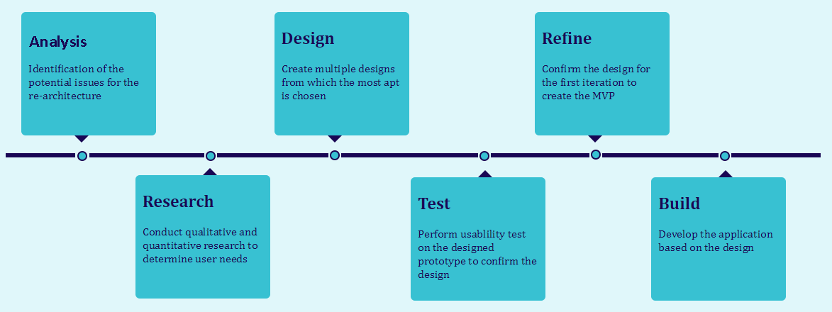
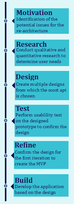
Analysis
The current website is analyzed and the potential issues are identified and listed. The business goals are defined along with the things that have to be considered when re-designing the new version of the website.
Business Goals :
- To improve the brand identity and reach of the pizzeria
- To increase their market share and stay ahead of their competitors
- Attract new customers and retain existing customers thus increasing revenues
Things to consider for re-designing :
- Provide essential store information readily available
- Find out all the basic features and options that users browse for in a typical pizzeria website
- Make the website intuitive
- Design a website that is in line with Jakob Nielsen's 5 quality components of usability
- Learnability: How easy is it for users to accomplish basic tasks the first time they encounter the design?
- Efficiency: Once users have learned the design, how quickly can they perform tasks?
- Memorability: When users return to the design after a period of not using it, how easily can they reestablish proficiency?
- Errors: How many errors do users make, how severe are these errors, and how easily can they recover from the errors?
- Satisfaction: How pleasant is it to use the design?
Research
Market Research : I began by looking for already existing pizzeria websites that did well in the market - mainly Domino's, Pizza Hut and Papa John's International based on pizzatoday's survey, 2019. Based on those websites, I listed out the most important and basic features that are found on all of them in common.
User Surveys : The next step was to back this up with some user research, to see if this was something others might be interested in and what information and features the customers might be looking for in a pizzeria website. I started by making a simple survey using Google Forms and sending it out to friends, colleagues and strangers over social media, who would be potential pizza buyers.
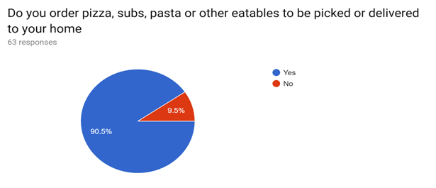
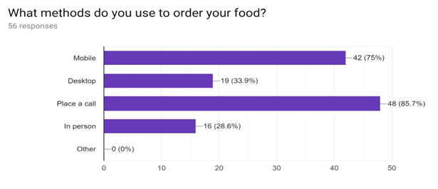
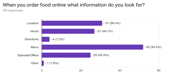
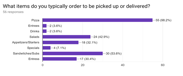
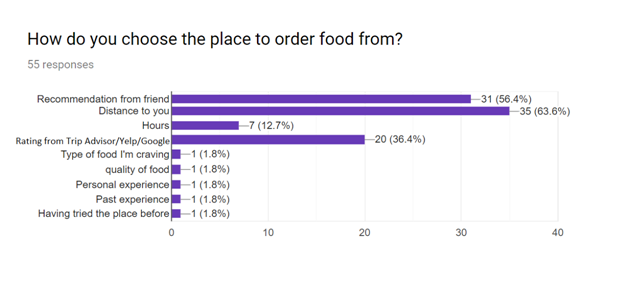
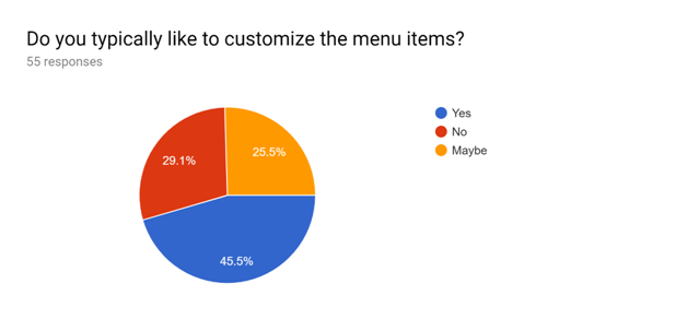
From the user research surveys, it is clear that most of the people prefer to place call-in orders for pizza, sandwiches and salads. The most looked up information includes the menu, location, hours of operation, and deals available. They choose the pizza place based on the distance, recommendation from a friend and ratings from google/yelp/trip advisor.
User & Task Analysis
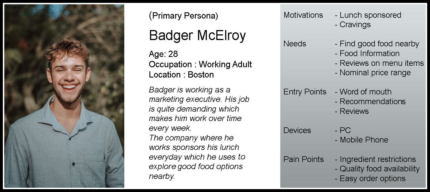
User Analysis - Personas :
From the user research and market research, I learned that irrespective of the demographics, the consumer needs for a pizzeria had mostly similar needs and frustrations. So I pictured one persona clubbing the characteristics of a potential pizzeria customer.
Task Analysis - Major Scenarios :
All the major scenarios are determined based on the most important tasks Badger, our primary persona chooses to do when visiting the website which is primarily determined from the research survey result. The tasks are then ordered based on the possible frequencies they would be performed in.
- Finding a pizzeria that are trusted by others
- Checking the menu
- Finding the phone number to place a call-in order
- Looking for pictures of food
- Looking for a pizzeria that accepts credit cards
- Looking for specialty menu items
- Checking for discounts
- Looking for a pizzeria close by
- Checking the pizzeria store hours
Feature Requirements :
Based on the task analysis, the features required to be included in the design that aids in performing each task are thought of and listed:
-
Task : Finding a pizzeria that is trusted by others
Features: Ratings, Customer testimonials, Awards
-
Task : Checking the menu
Features: Display the menu items
-
Task : Finding the phone number to place a call-in order
Features: Display the phone number
-
Task : Looking for pictures of food
Features: Pictures of food with their names displayed
-
Task : Looking for a pizzeria that accepts credit cards
Features: Icons of credit cards, Payment system (3rd party)
-
Task : Looking for specialty menu items
Features: List of specialty menu items
-
Task : Checking for discounts
Features: List of discounts, coupons, promotional codes
-
Task : Looking for a pizzeria close by
Features: Map (specifying locations and feature for checking directions)
-
Task : Checking the pizzeria store hours
Features: Display store hours
Consolidation of Feature List :
Based on the above feature listing, all the required features for the webapp are consolidated and prioritized as follows:
- Display of menu items
- Display of contact number
- Display of ratings/testimonials/awards
- Pictures of food with their names displayed
- Specification of payment modes accepted
- Display specialty menu
- Specification of discounts/coupons/promo codes
- Specification of maps/directions
- Display store hours
- Display of order completion time
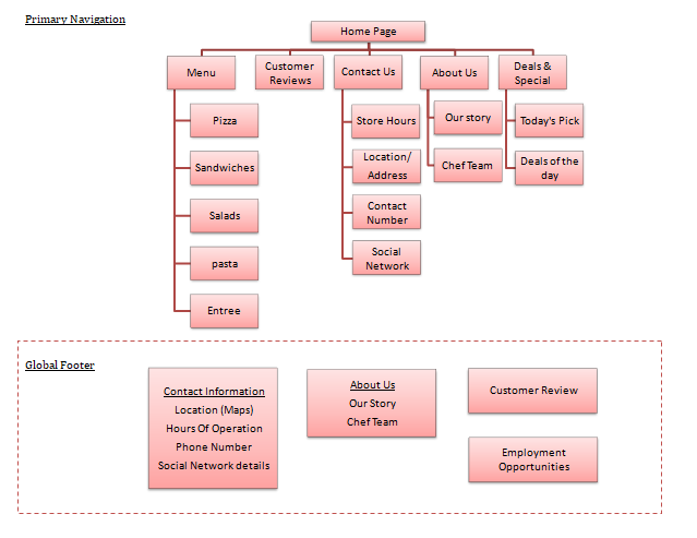
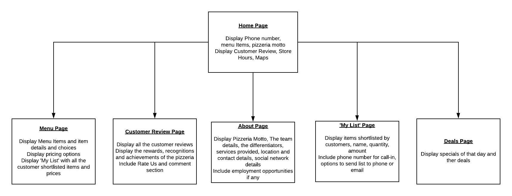
Information Architecture
The information architecture with all the features listed in the above process is then decided. The primary information and hierarchy is then done which summarizes as follows:
Low fidelity Wireframes
Following the research summary and information architecture, I came up with multiple rough sketches of what the wireframes of each page would look like. With multiple iterations of sketches, I was able to make the UX lean by segregating the essentials from the unimportant elements were getting more and more clear. The multiple wireframes were then compared and the best design was chosen which served as the primary base design for the final website.
Paper Prototypes
Below are the fine tuned paper prototypes that serve as the templates for most of the basic use cases :
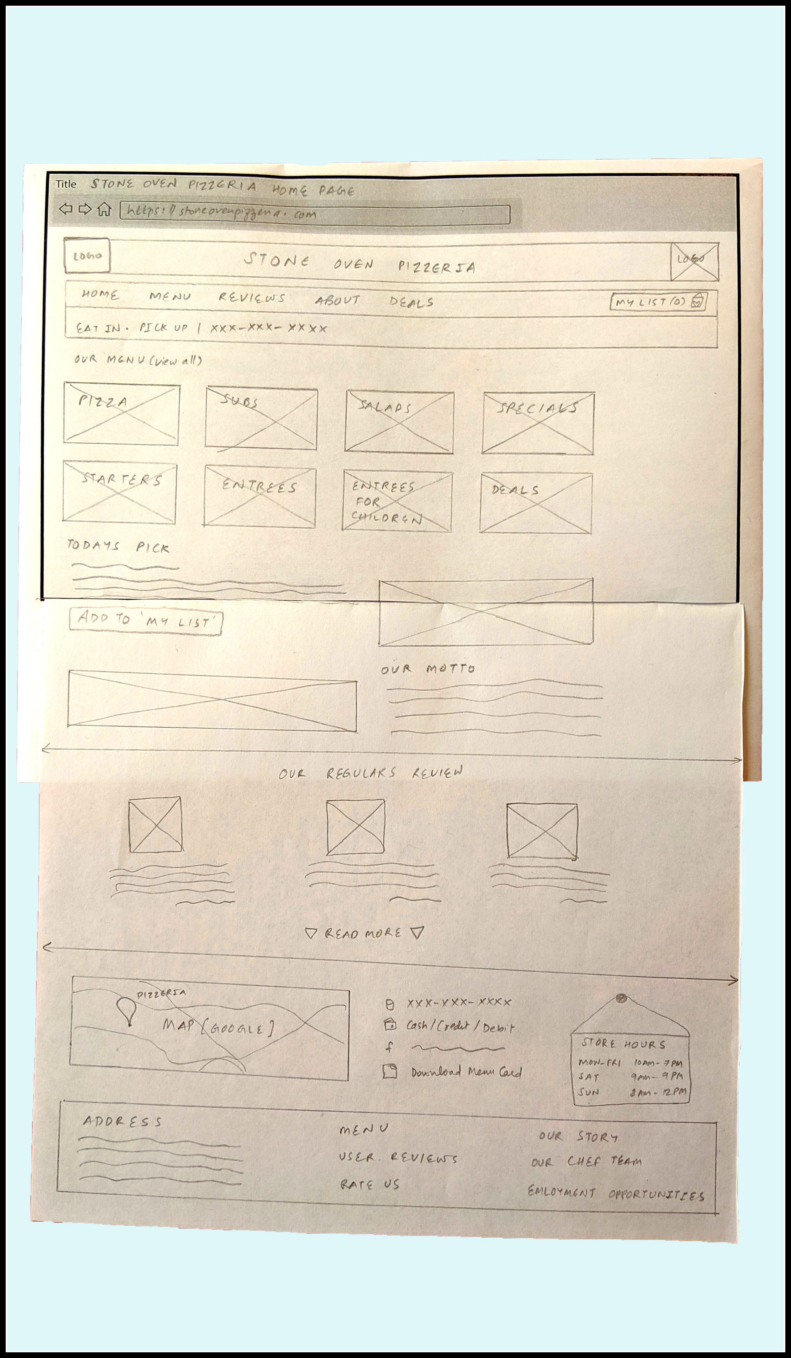
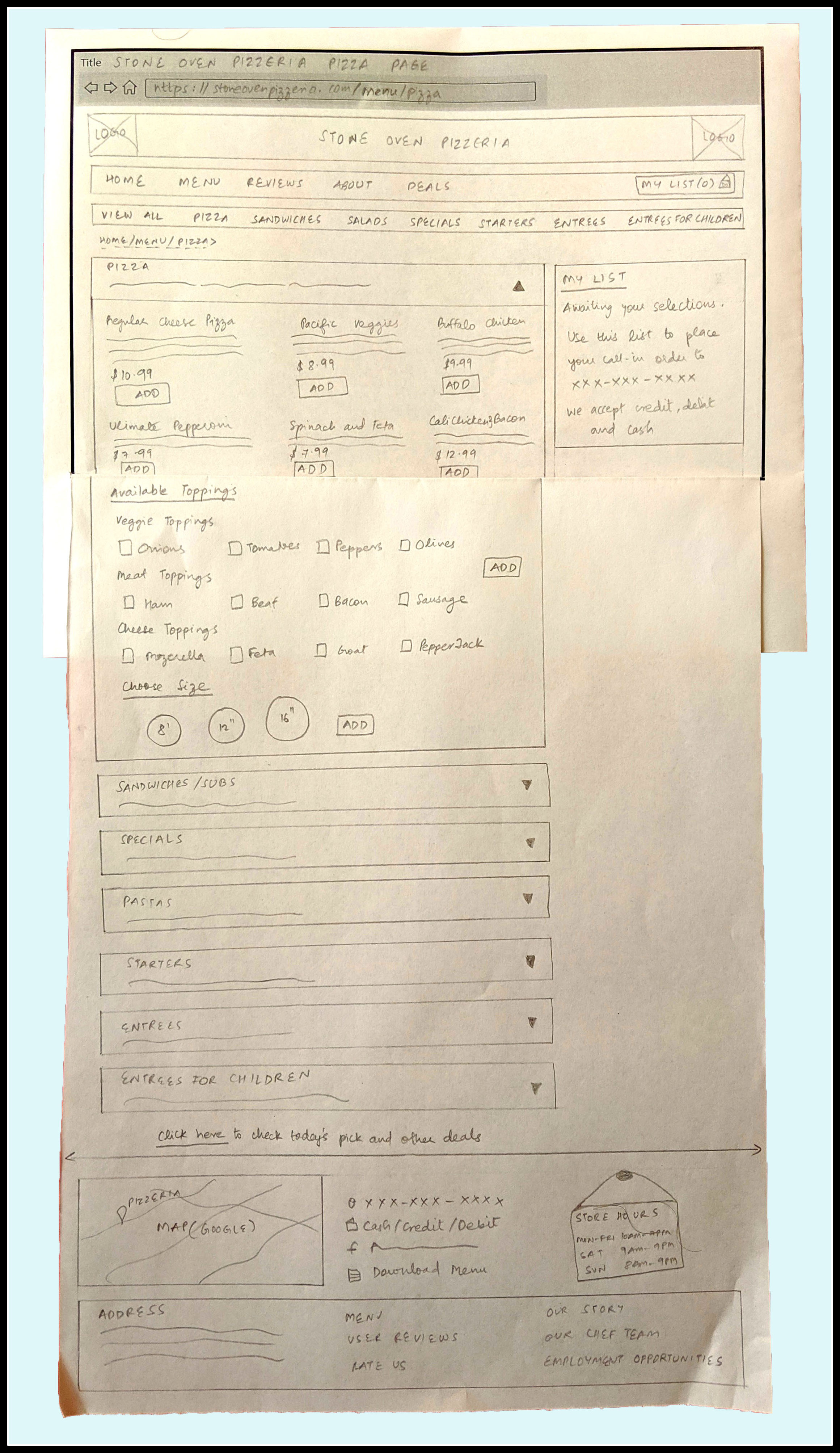
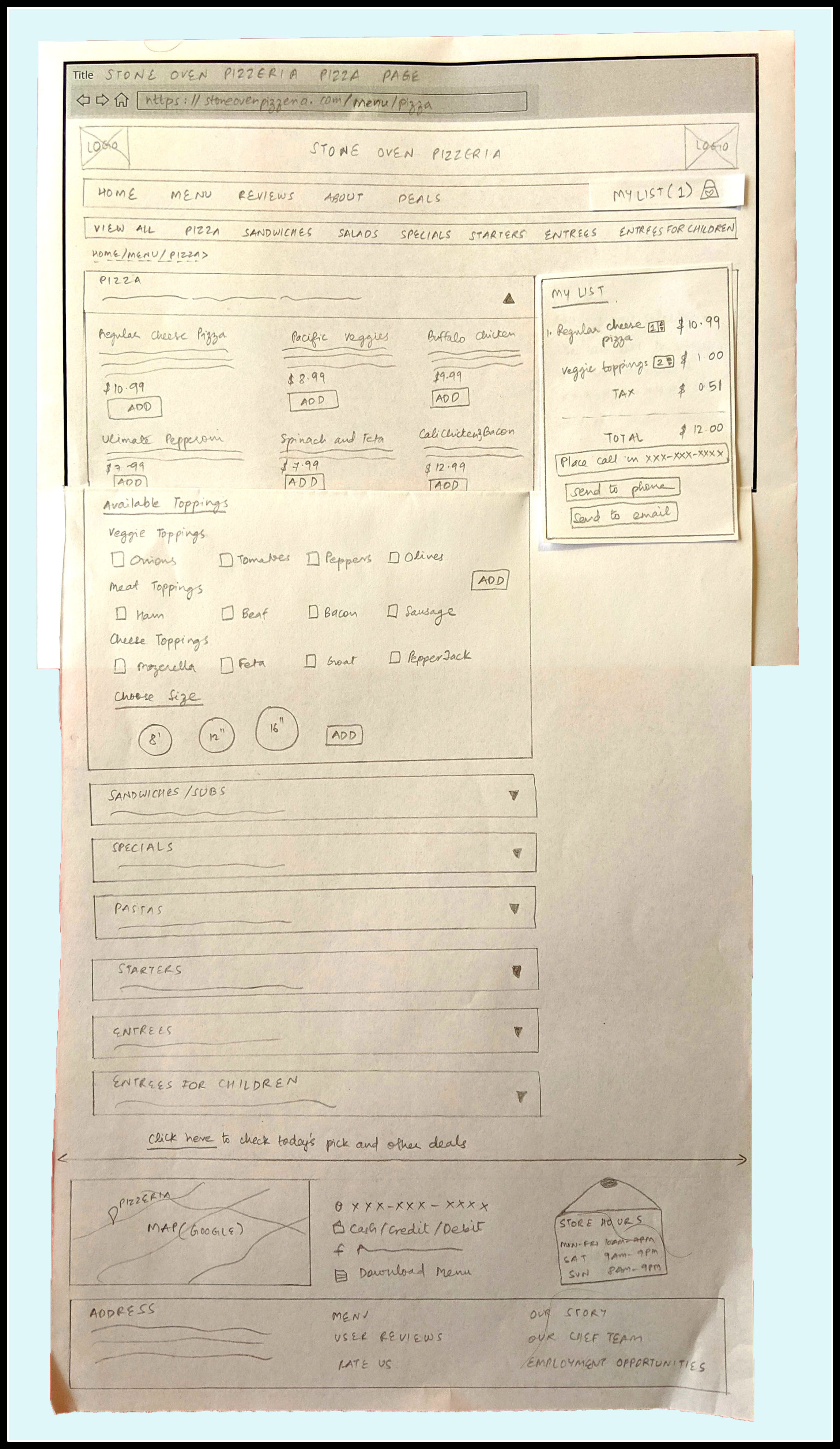
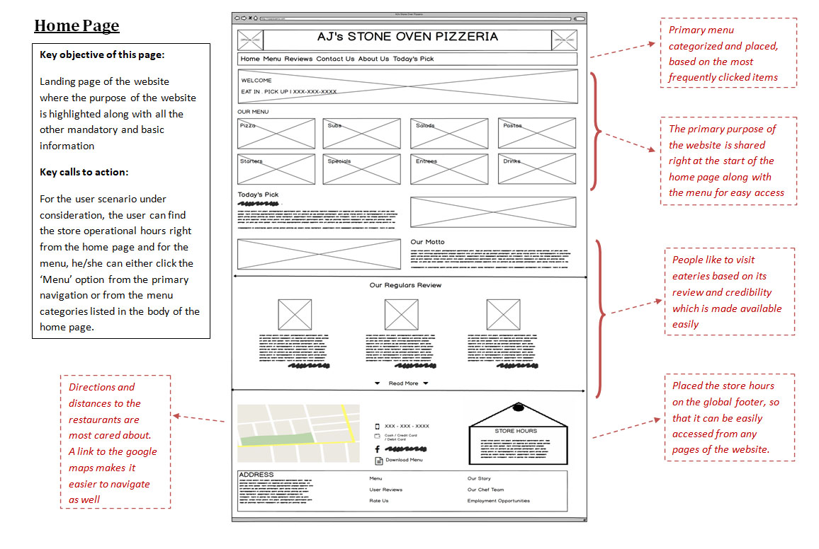
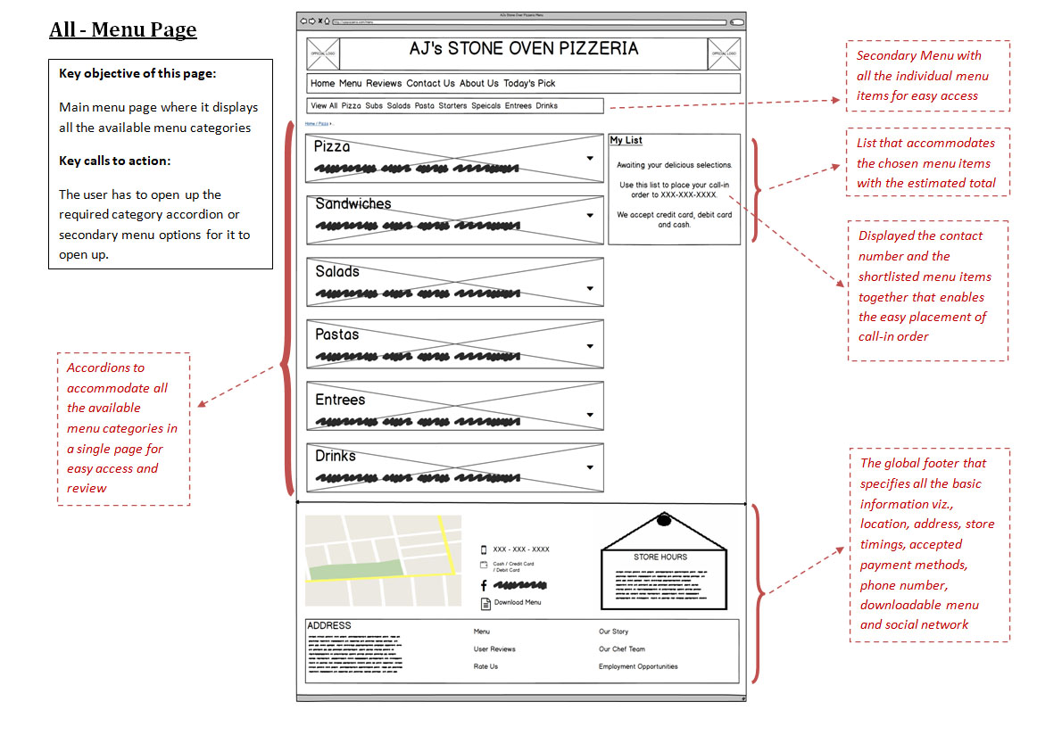
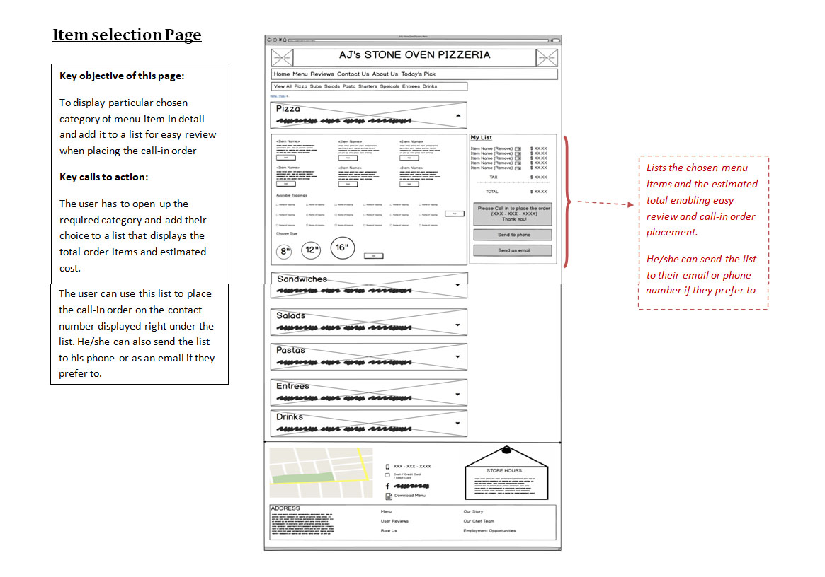
Design Rationale
From multiple prototypes for each page, the best one is chosen based on the survey results as well as competitor research. More detailed rationale for each feature placement is indicated below:
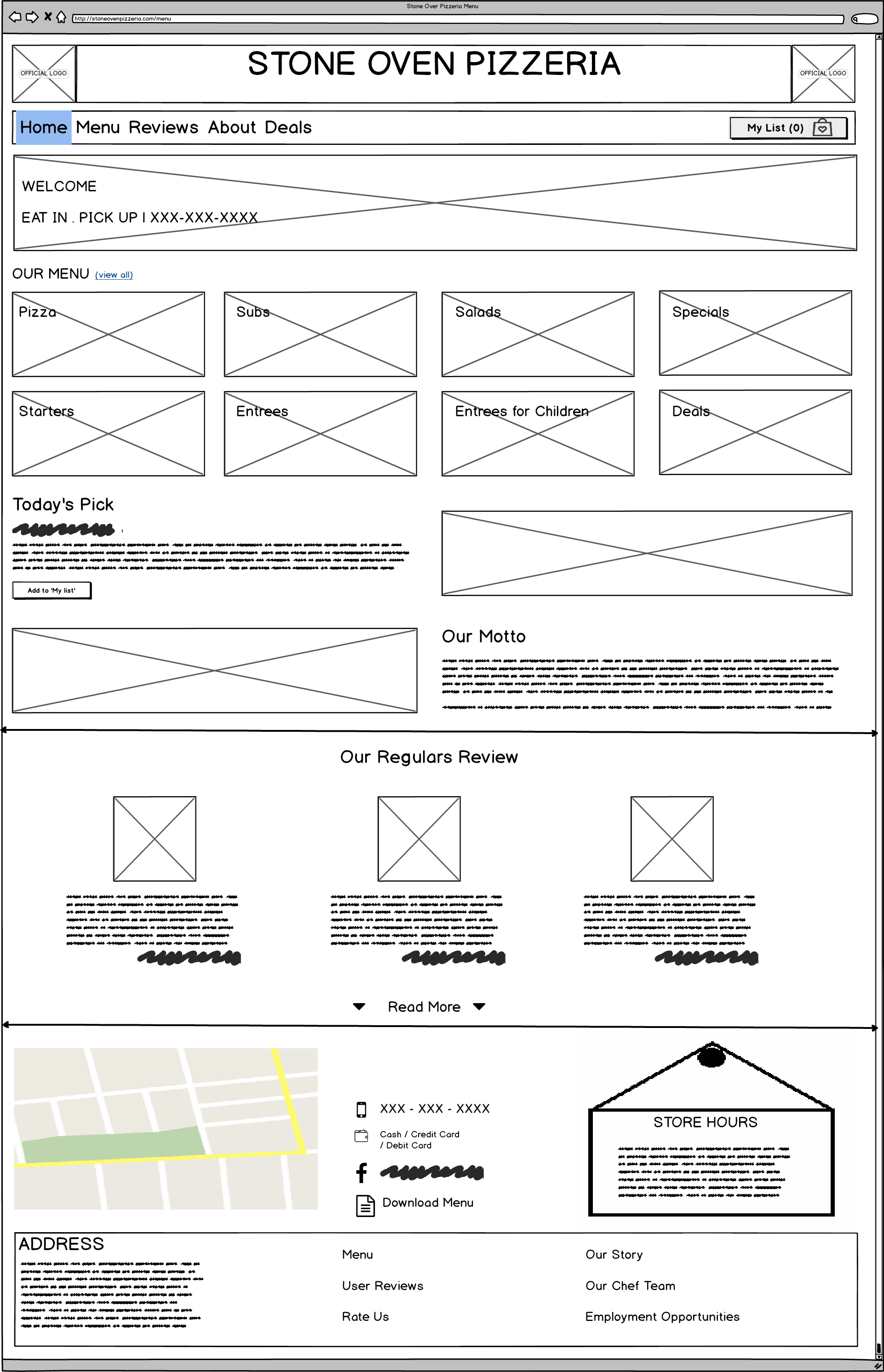
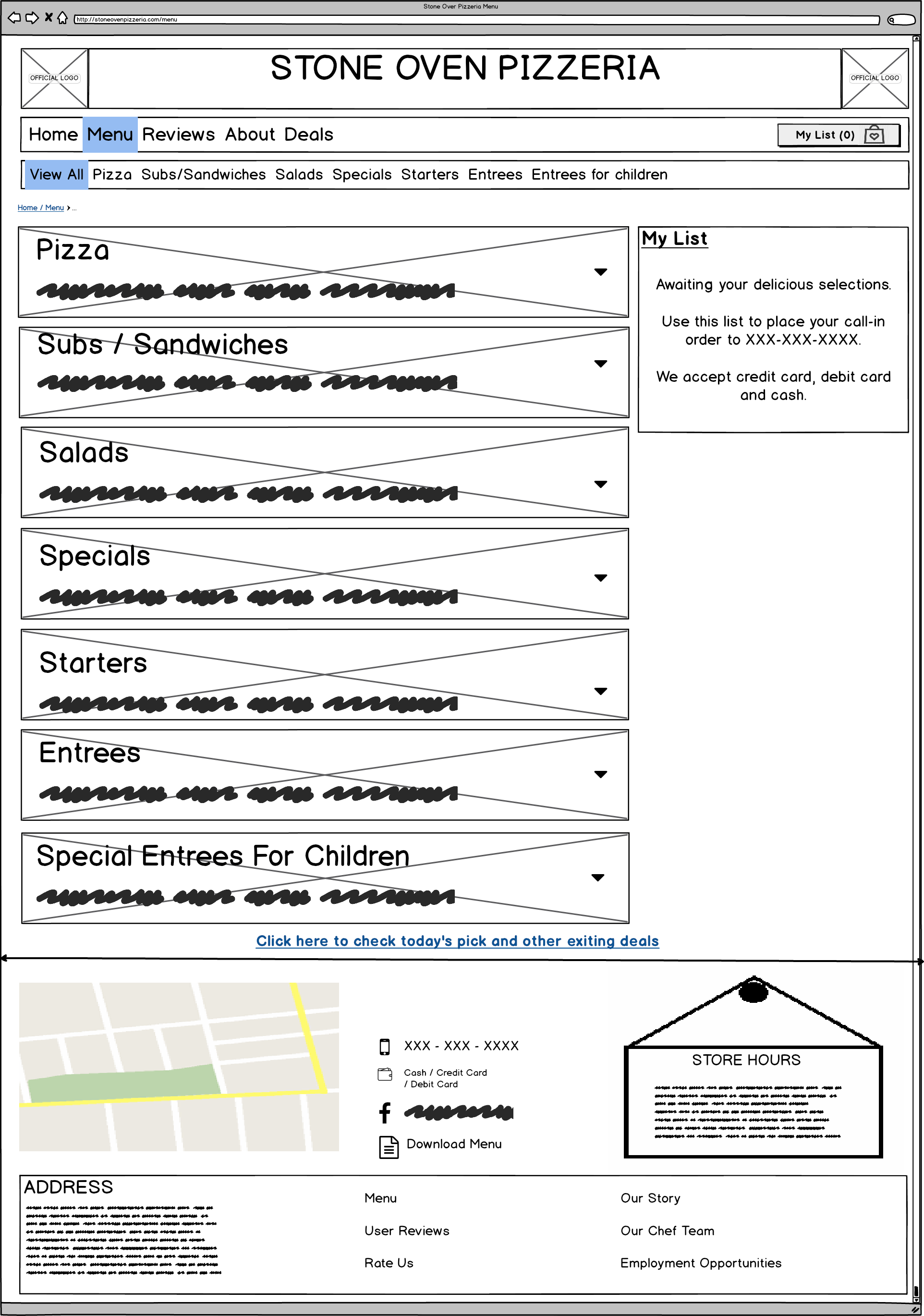
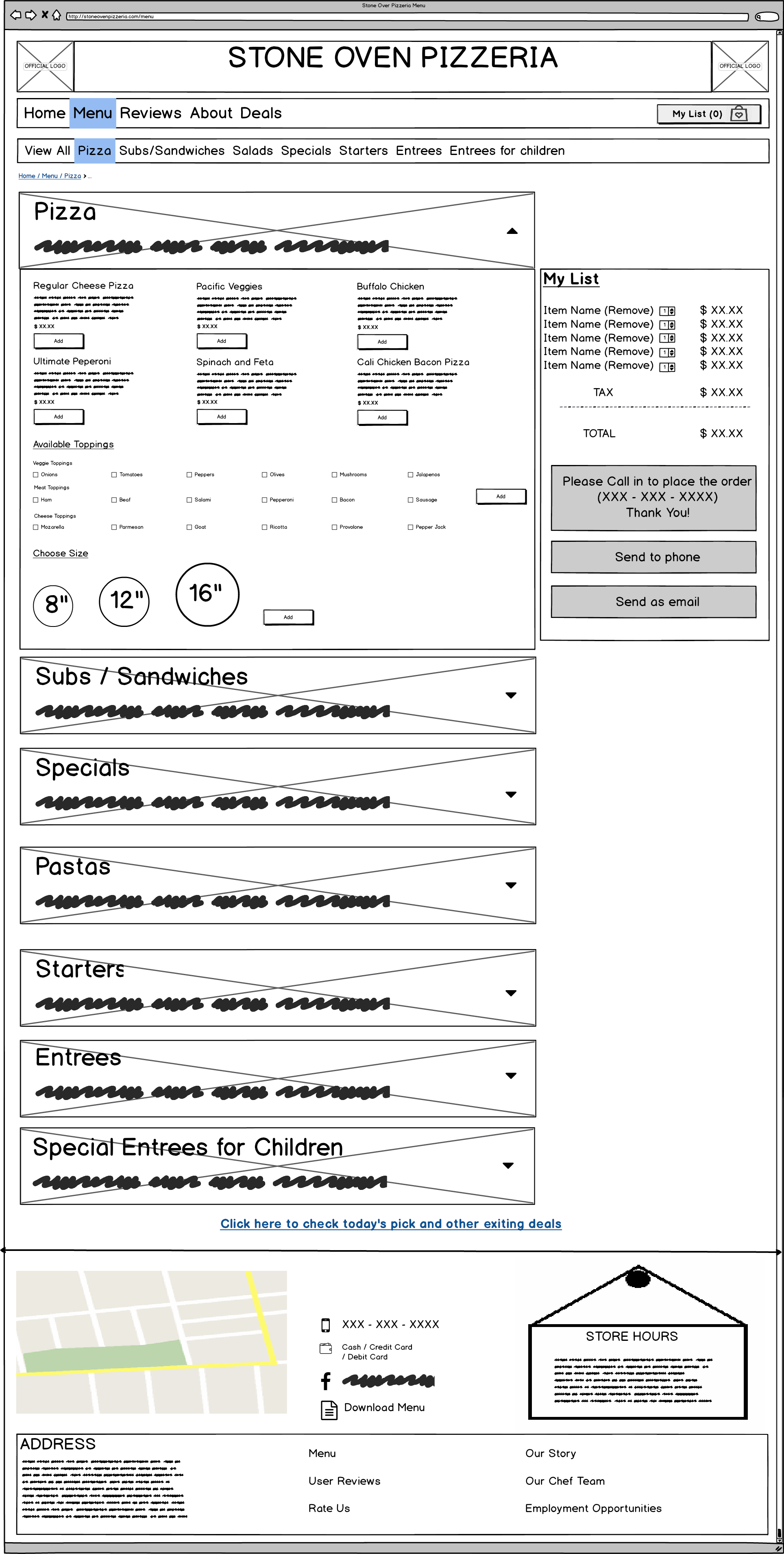
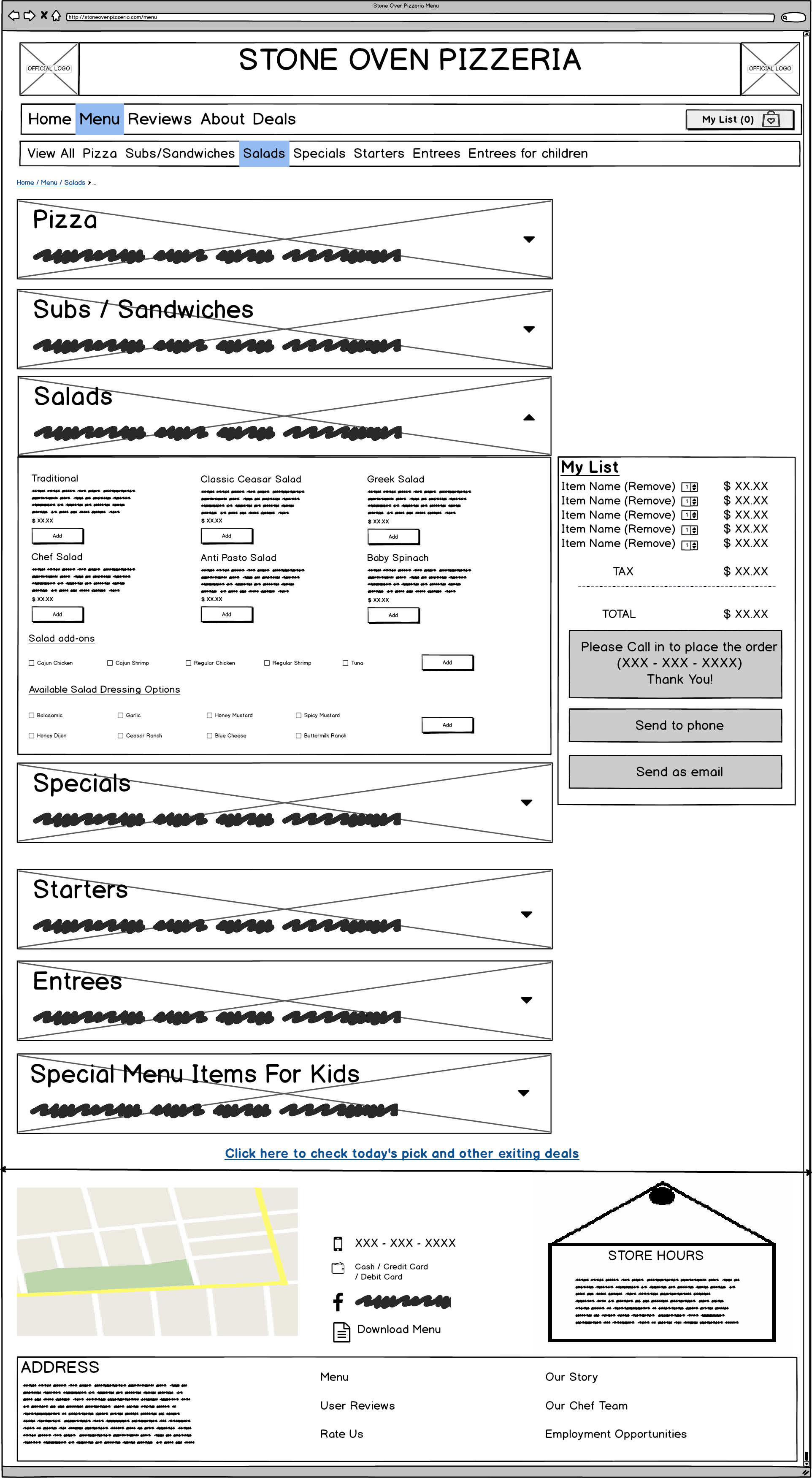
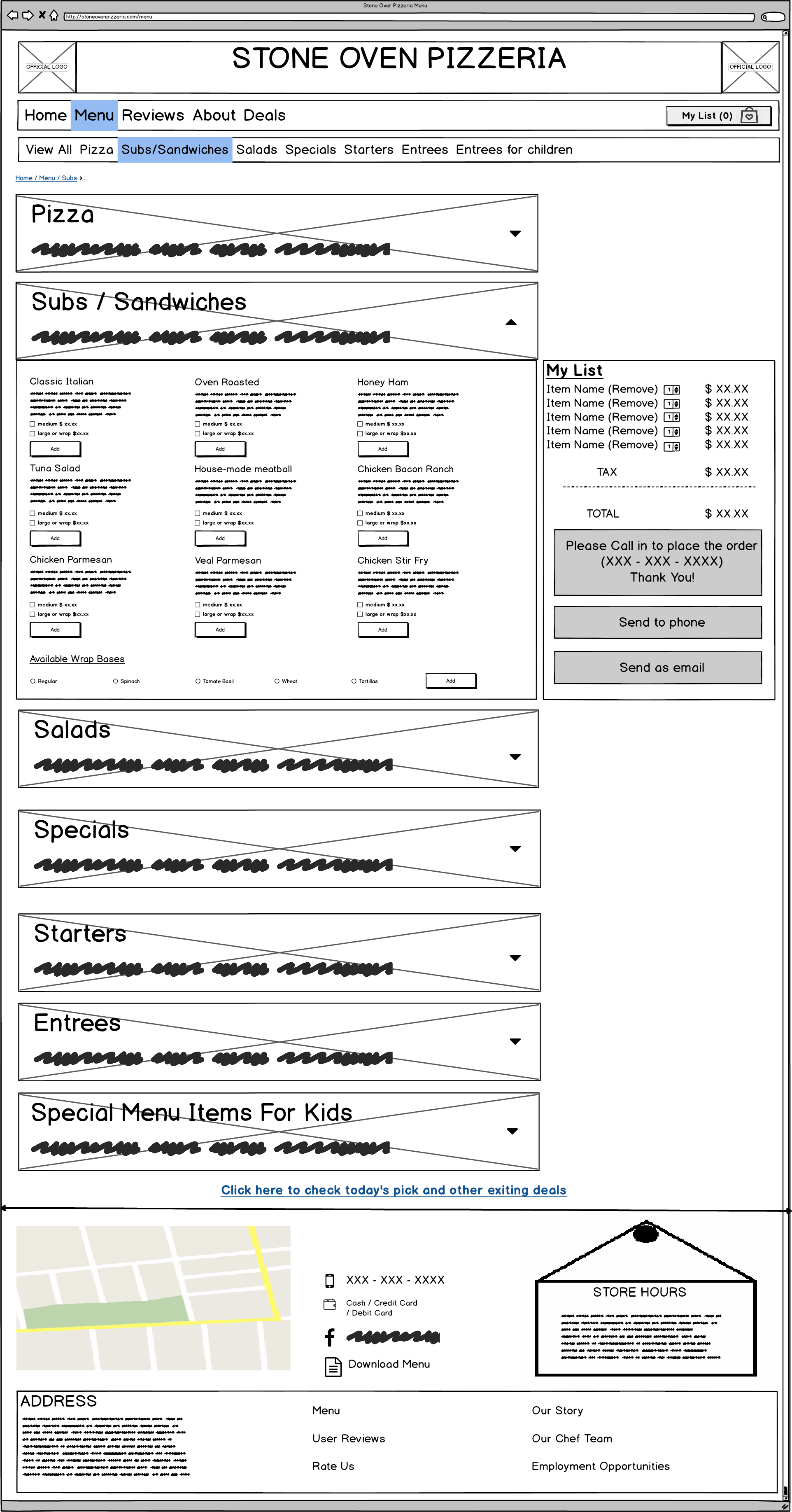
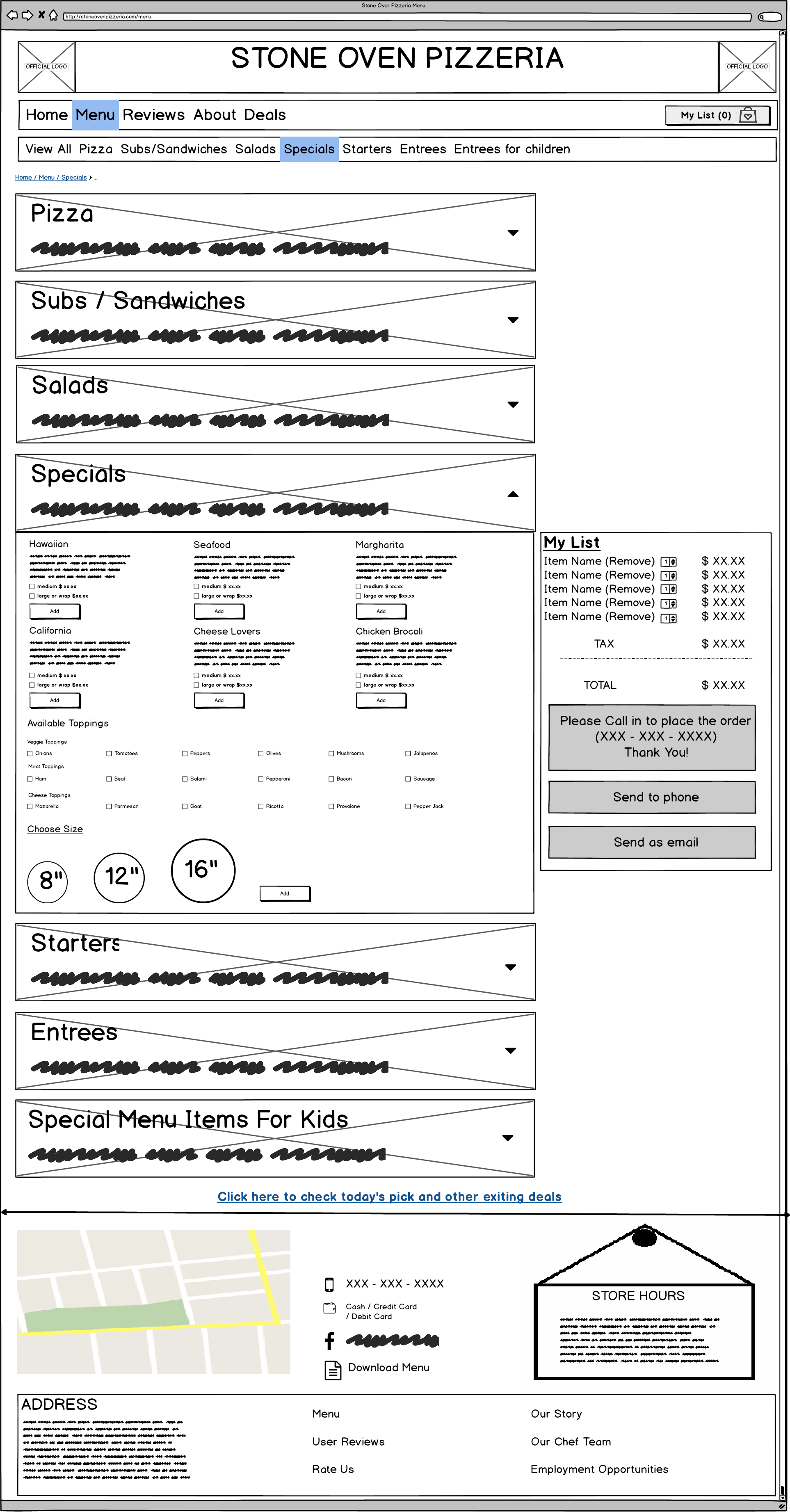
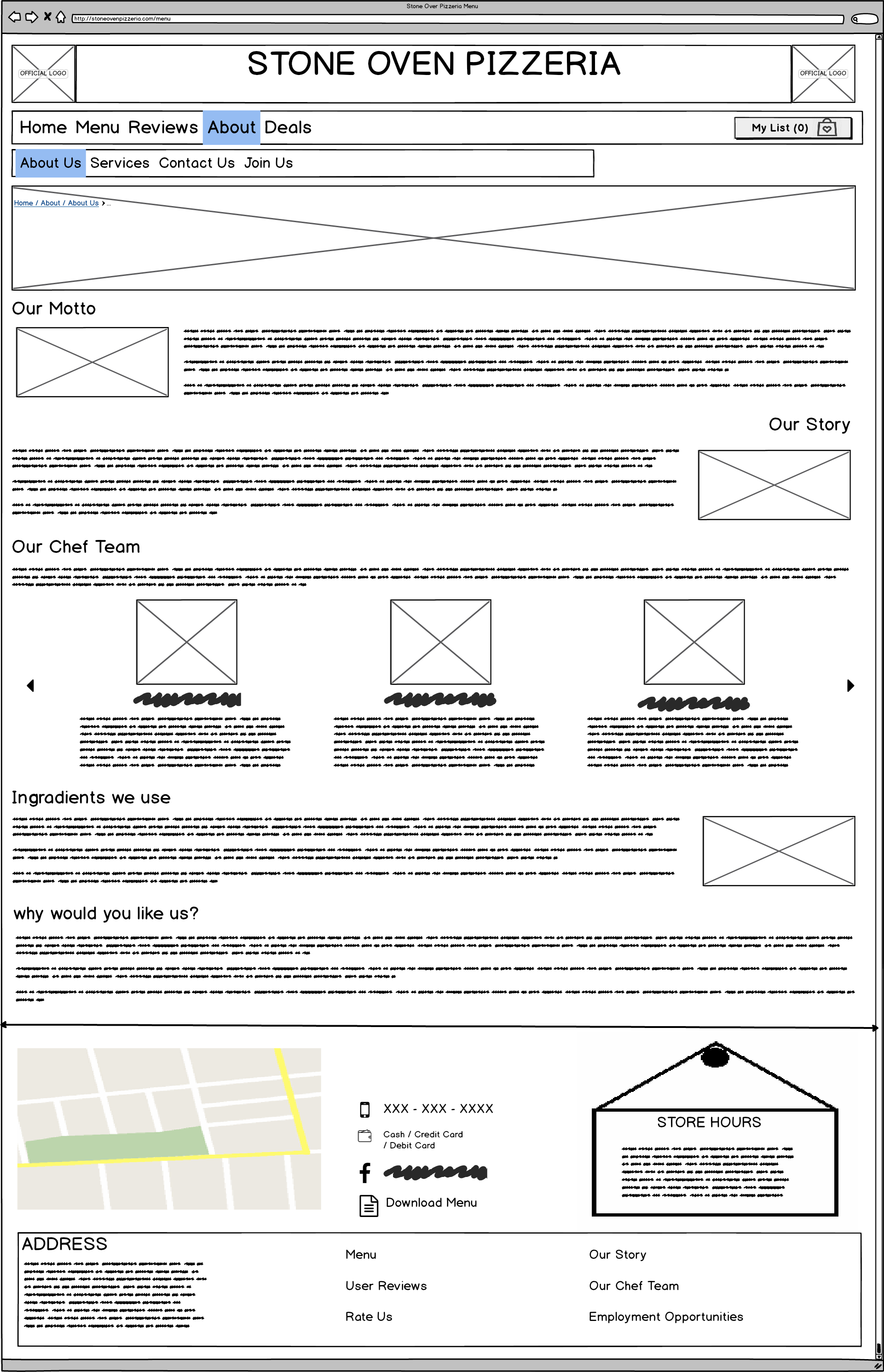
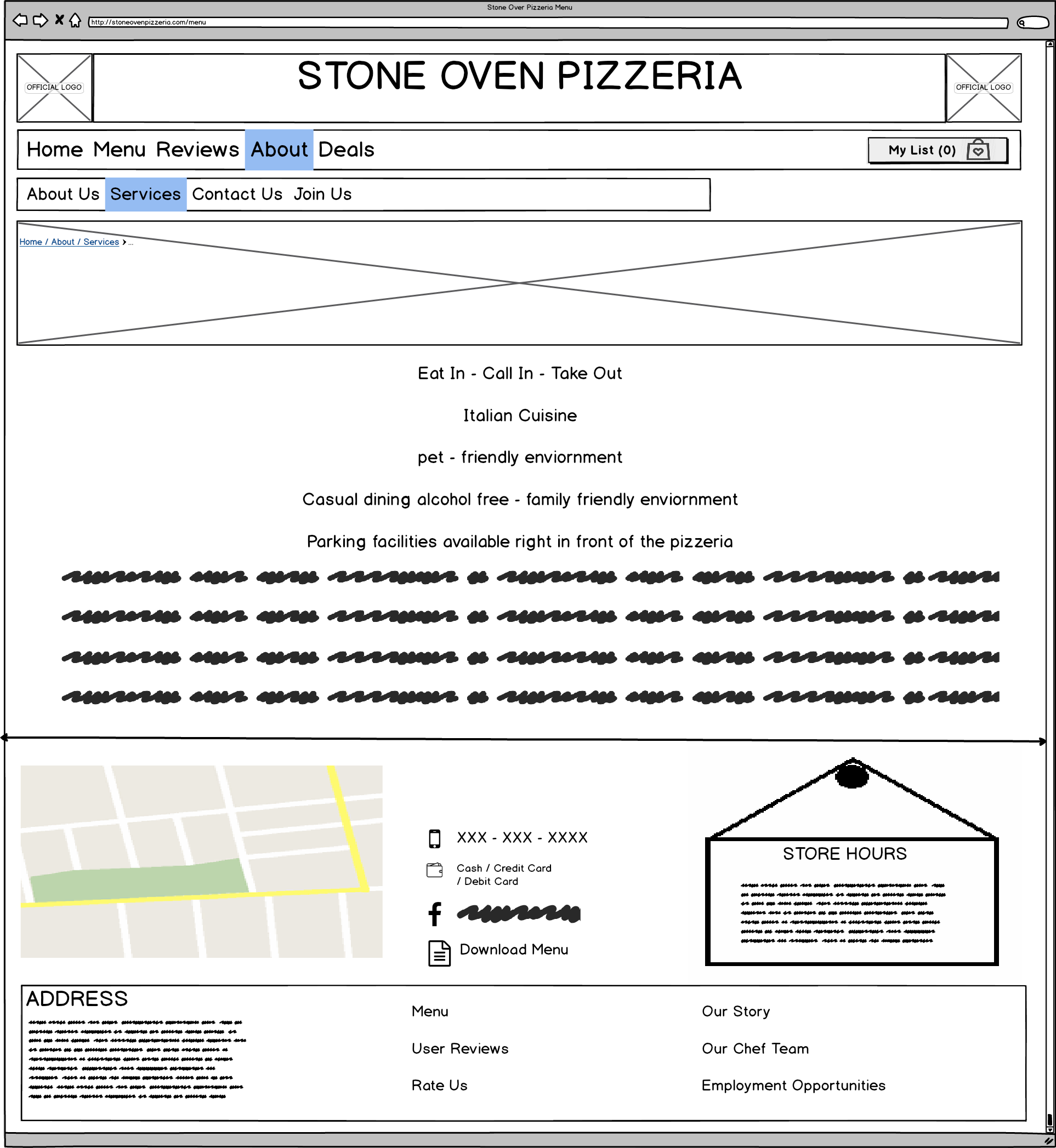
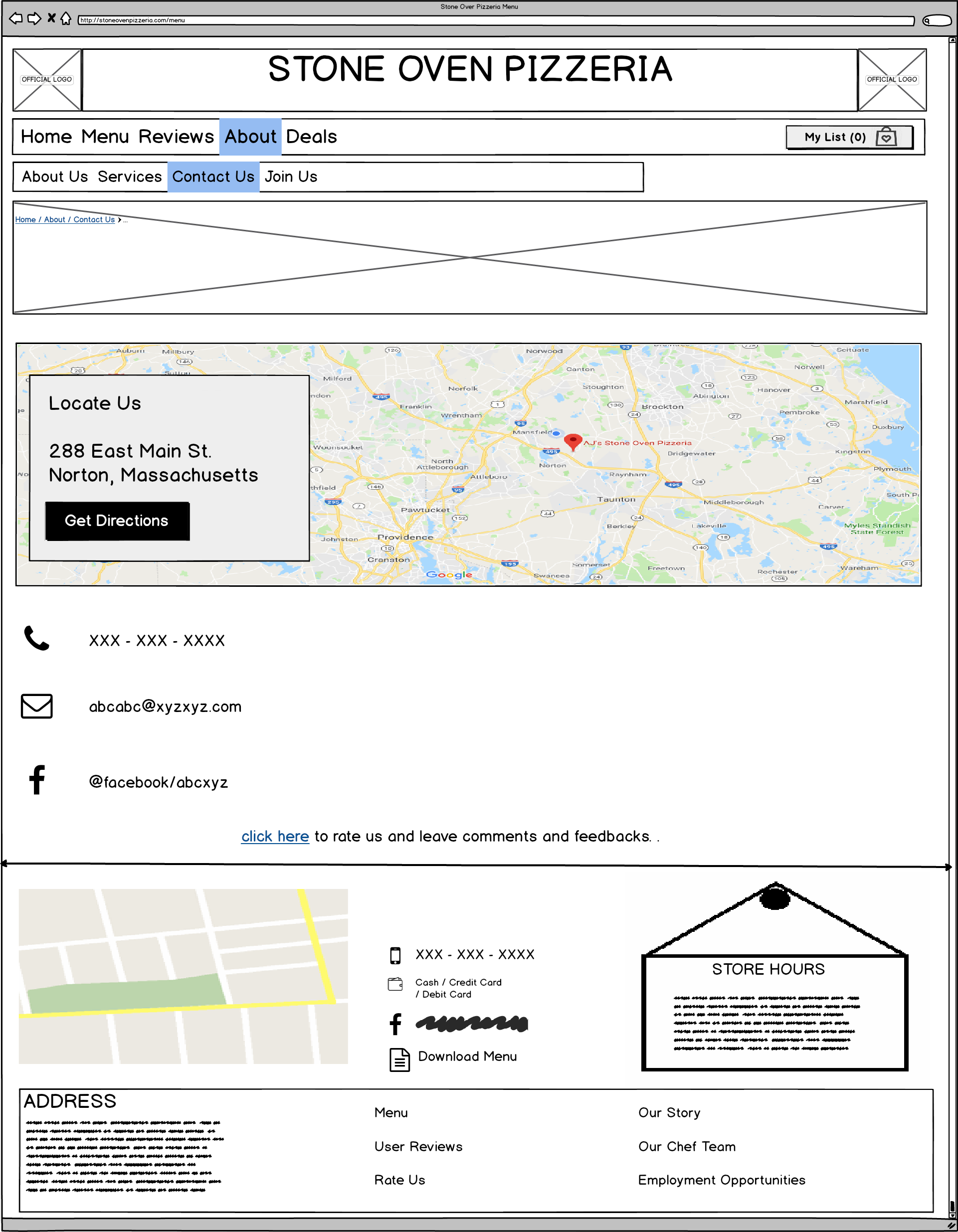
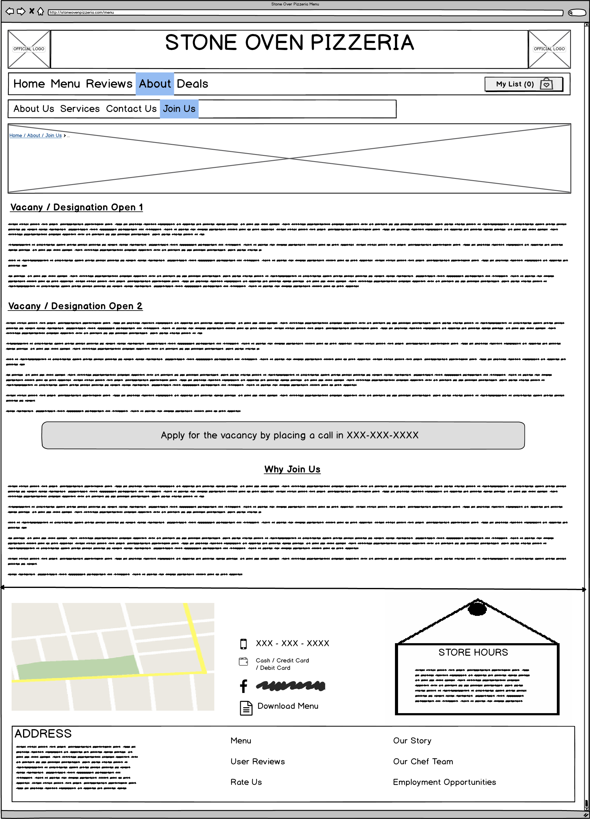
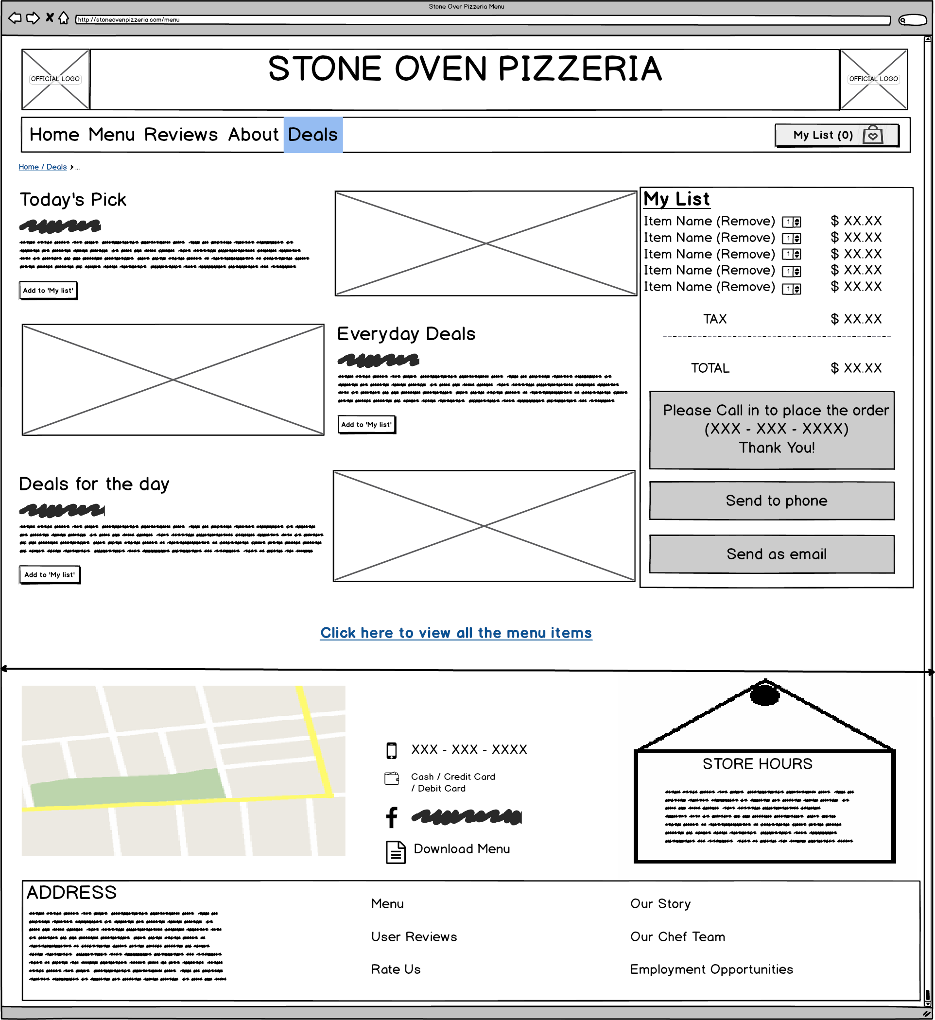
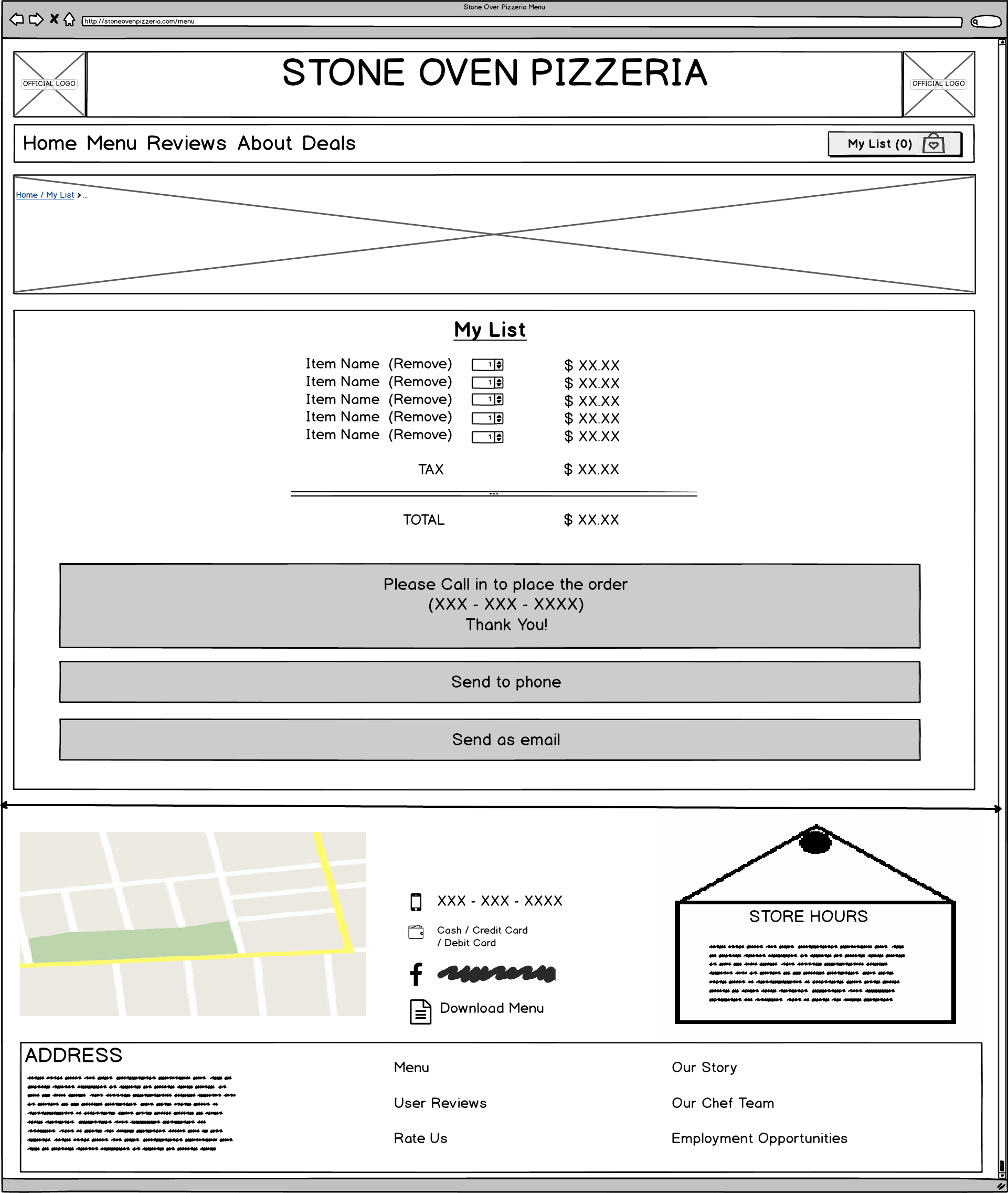
Balsamiq Wireframe
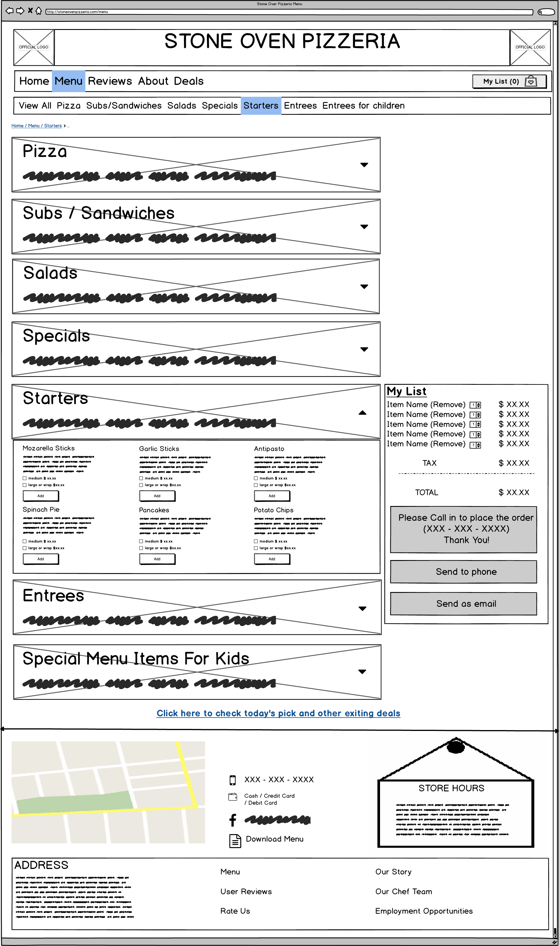
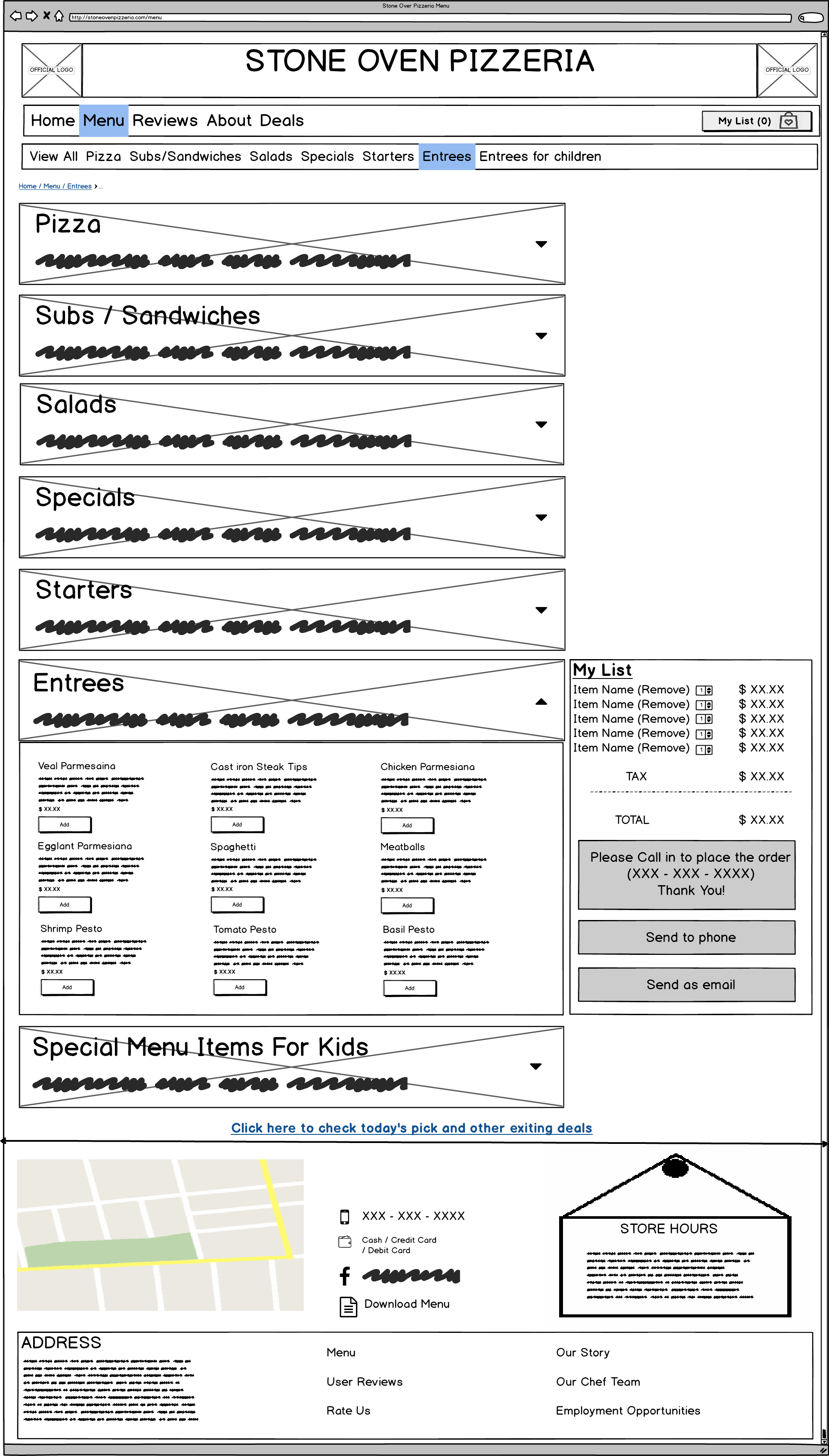
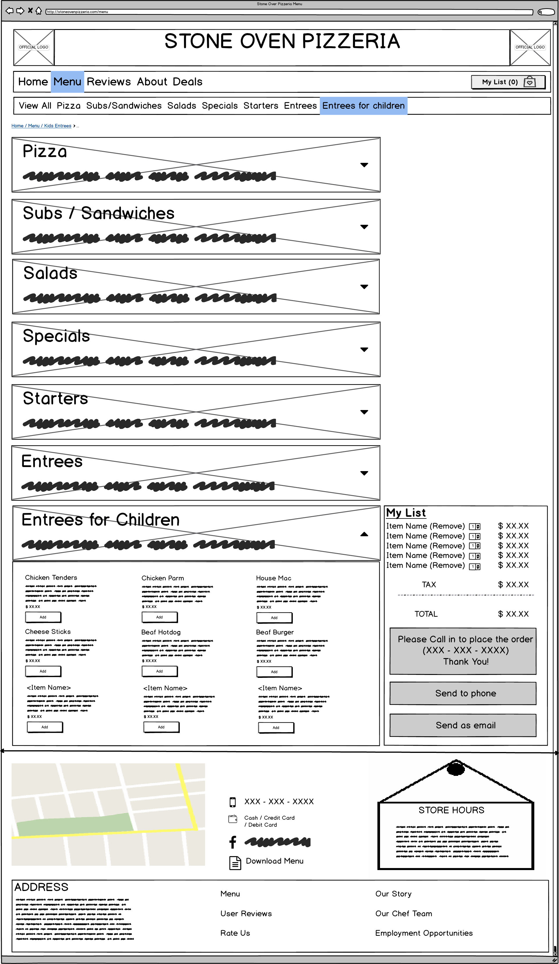
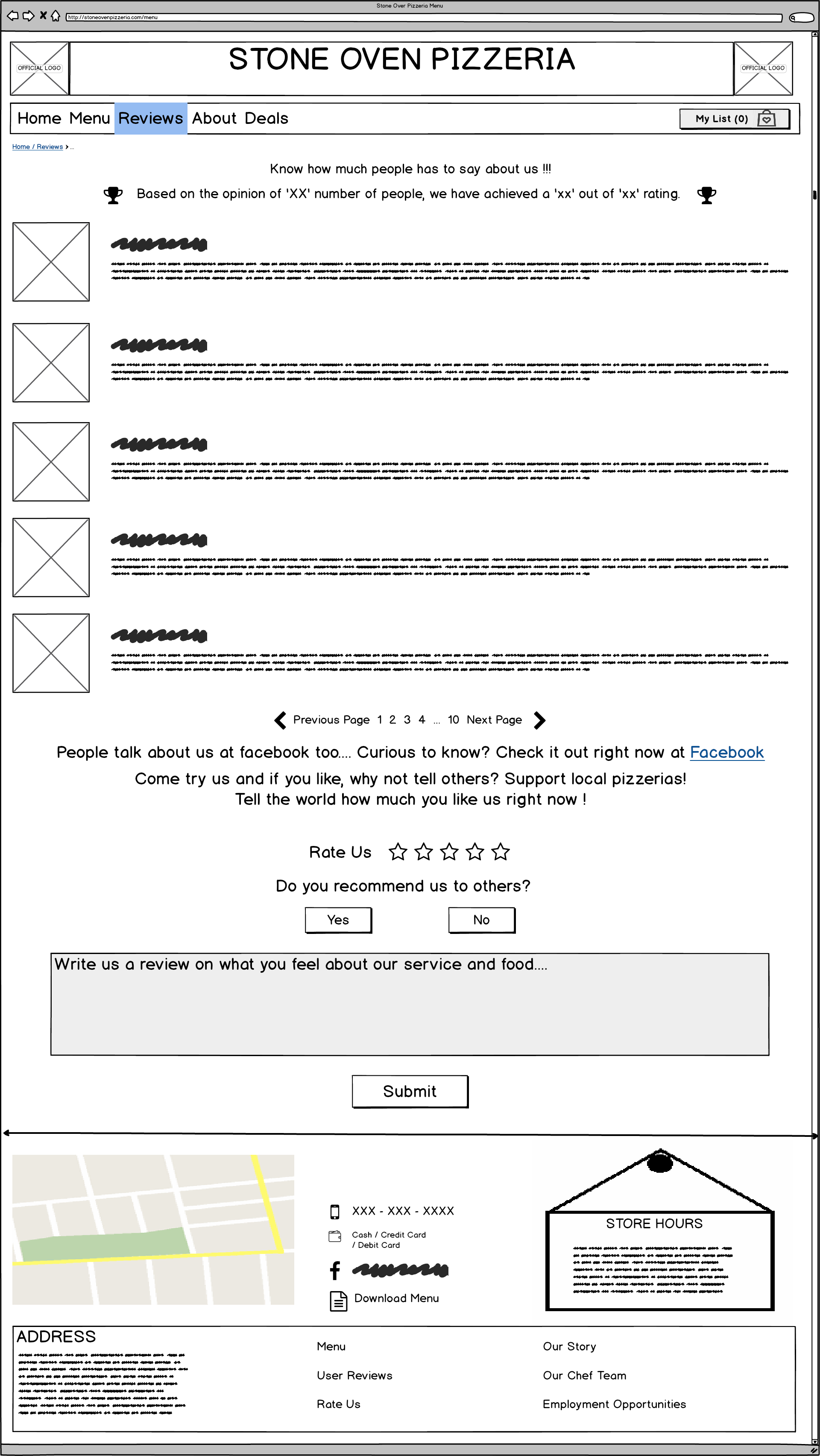
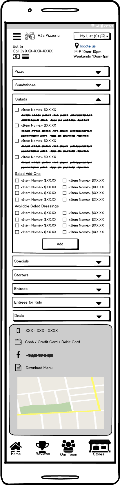
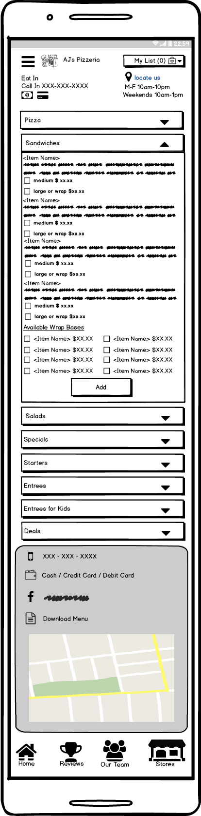
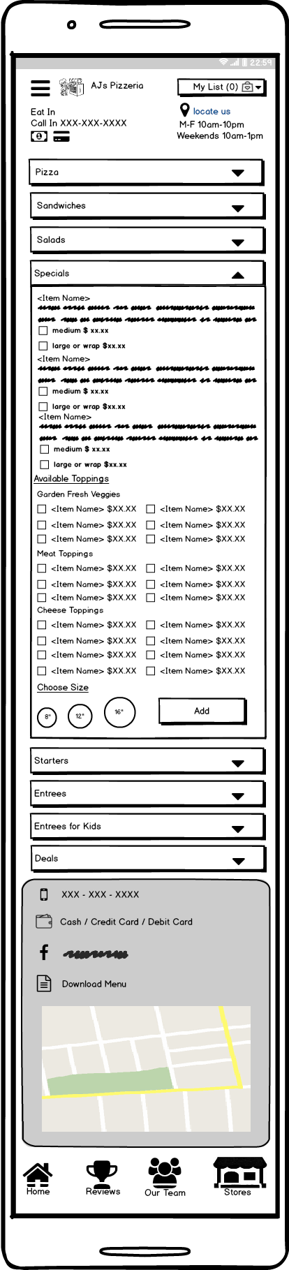
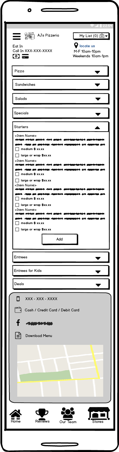
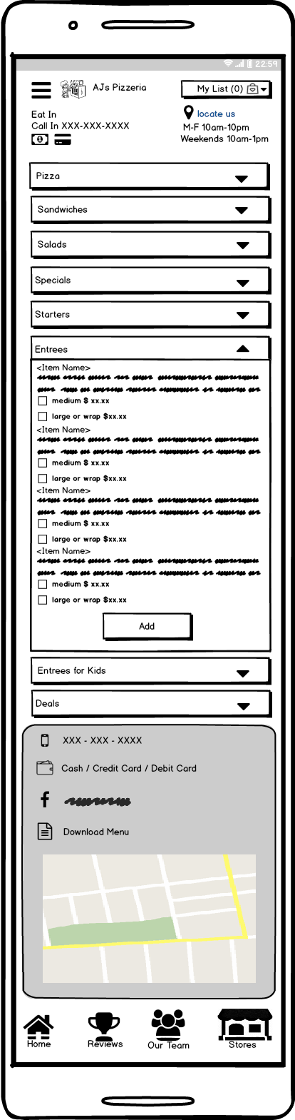
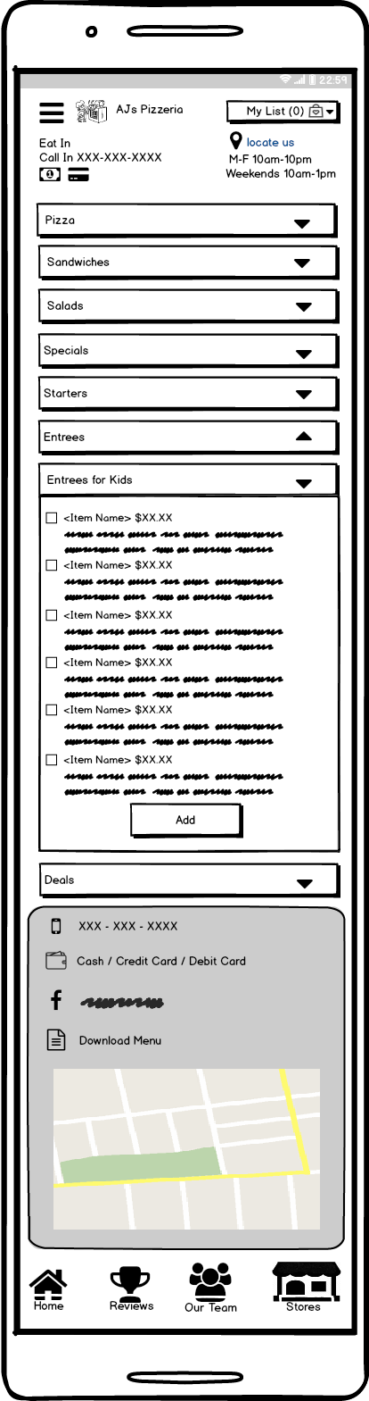
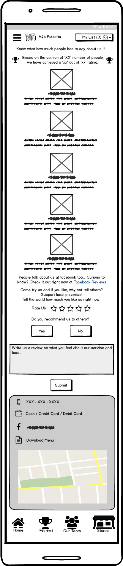
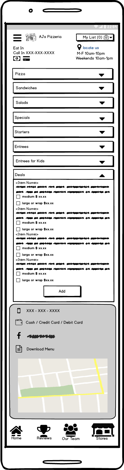
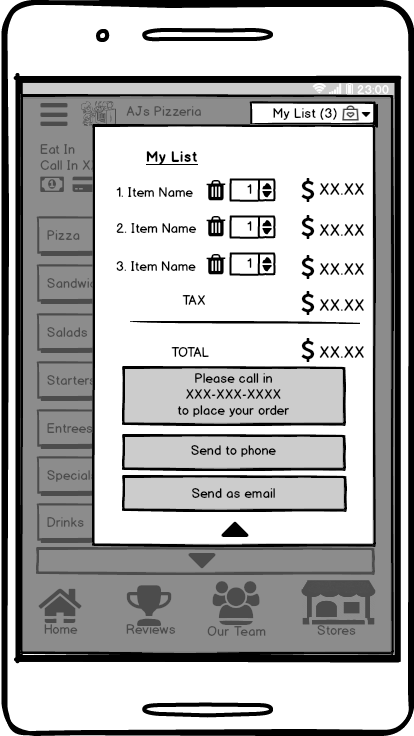
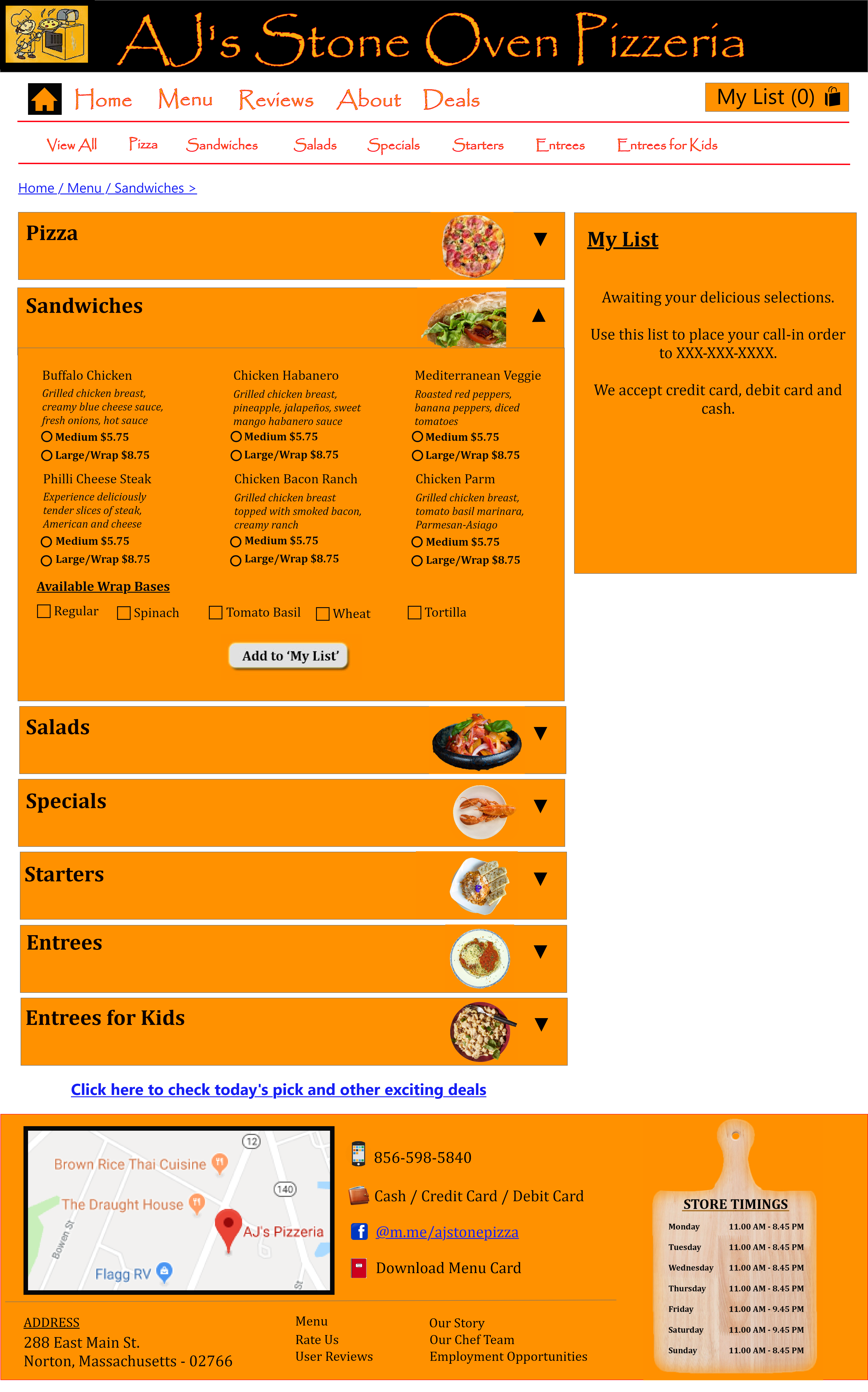
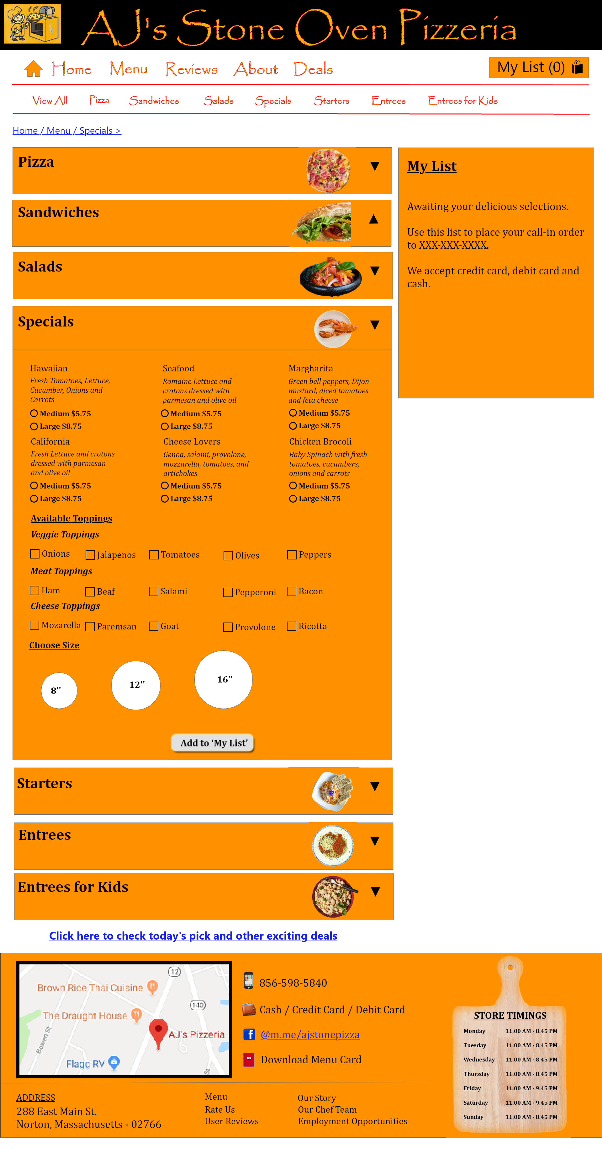
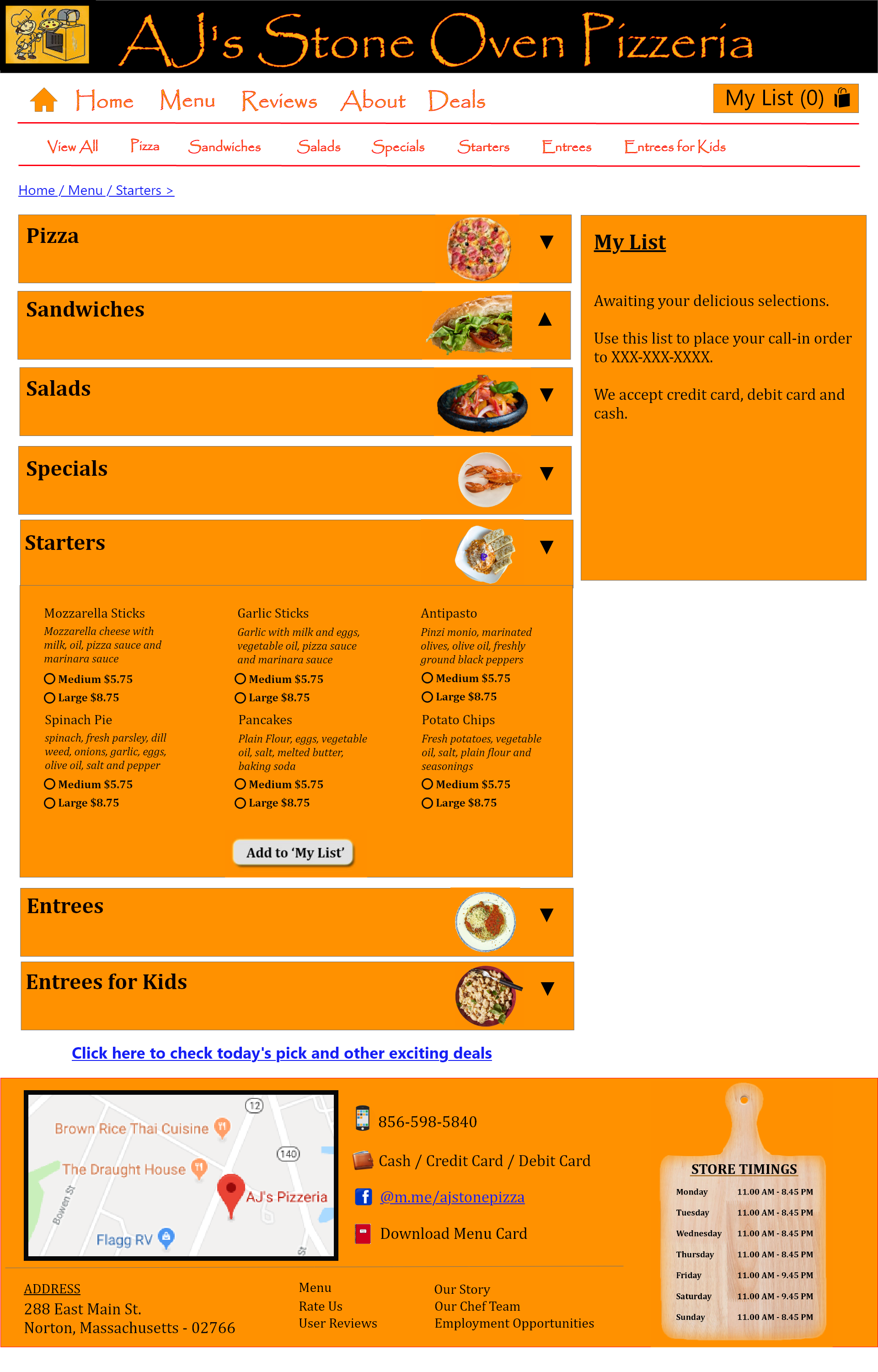
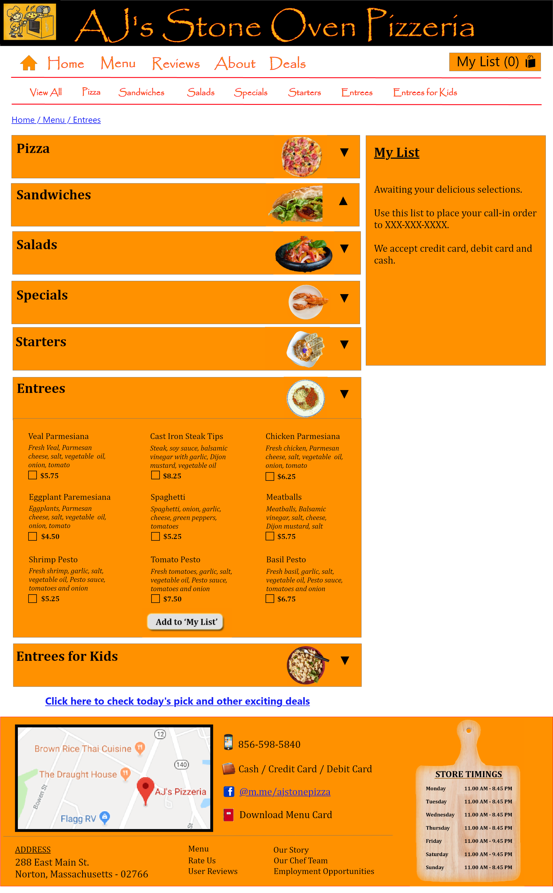
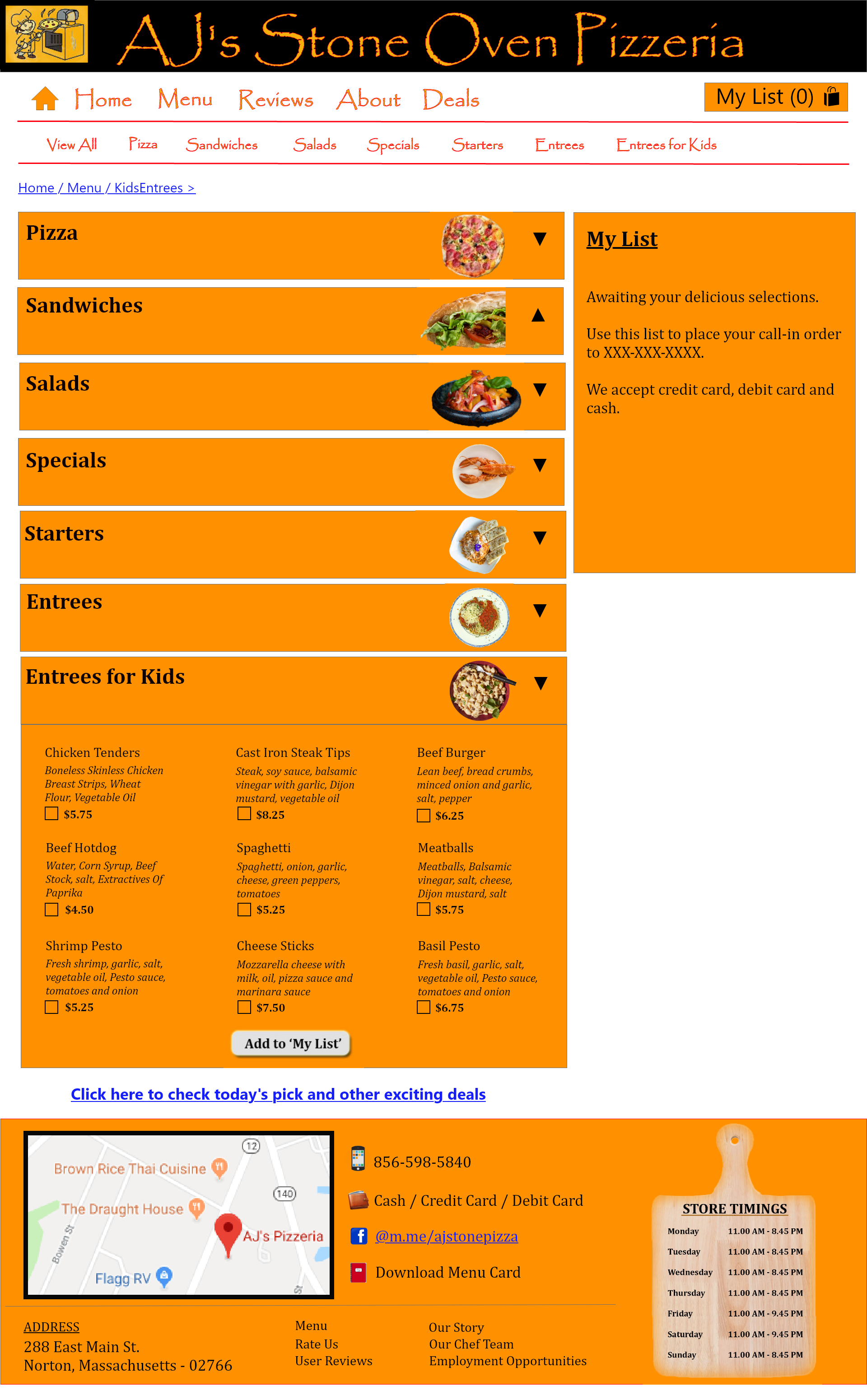
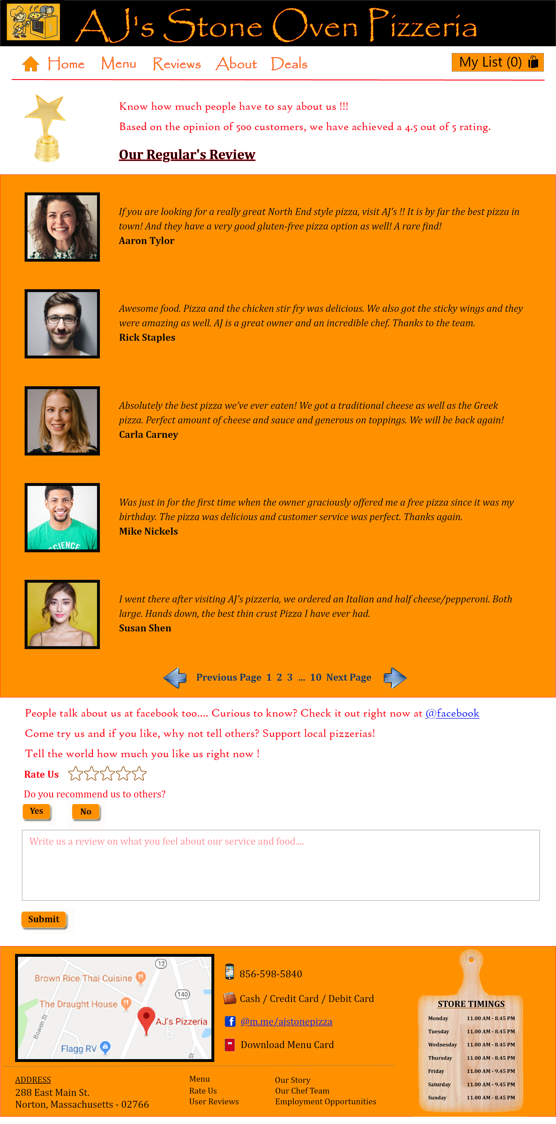
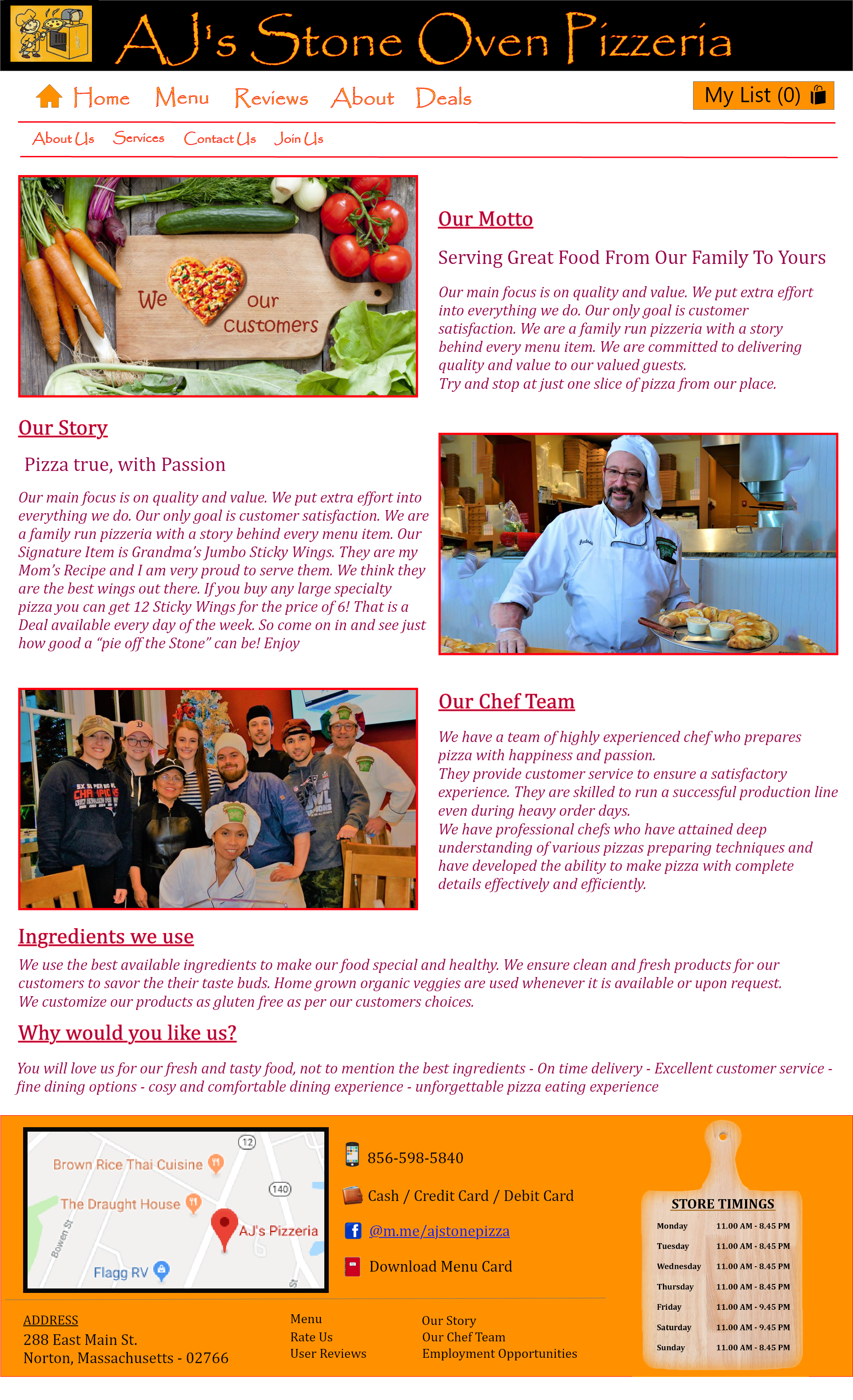
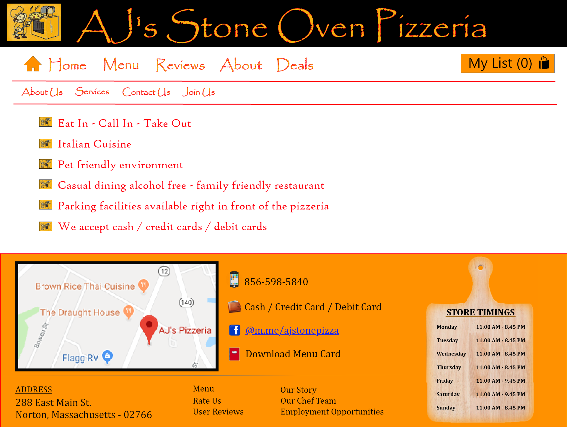
Below is a set of wireframes based on the paper prototype. There are a total of 16 pages for the website and all of them are wireframed using Balsamiq.
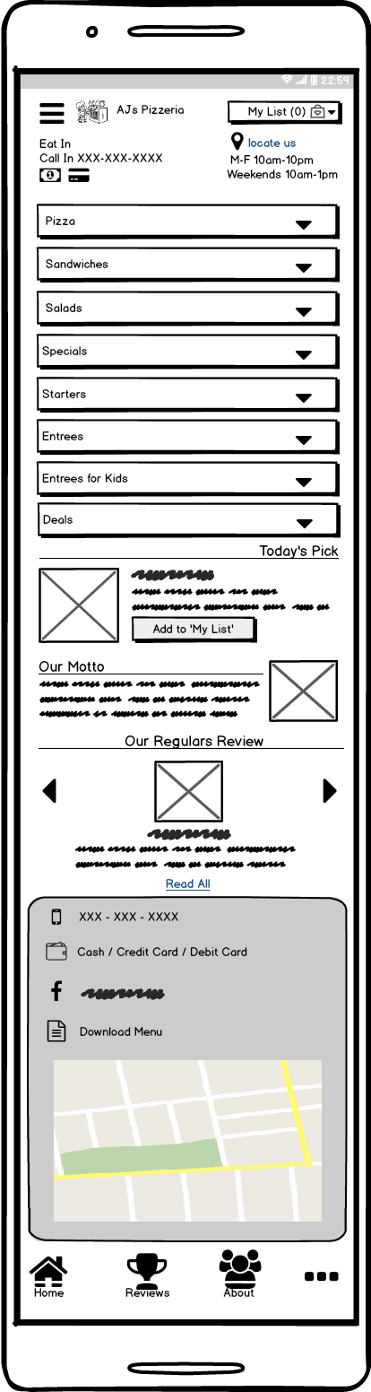
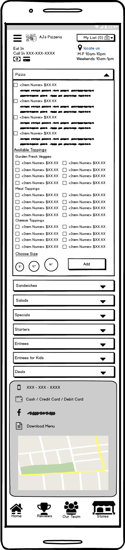
Below are the wireframes designed in Balsamiq for mobile users:
High fidelity Prototype
The specifications for high fidelity prototype are decided considering the human factors for experience design.
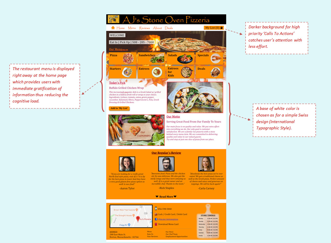
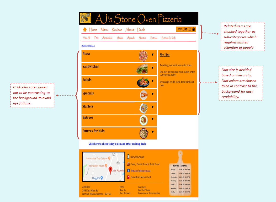
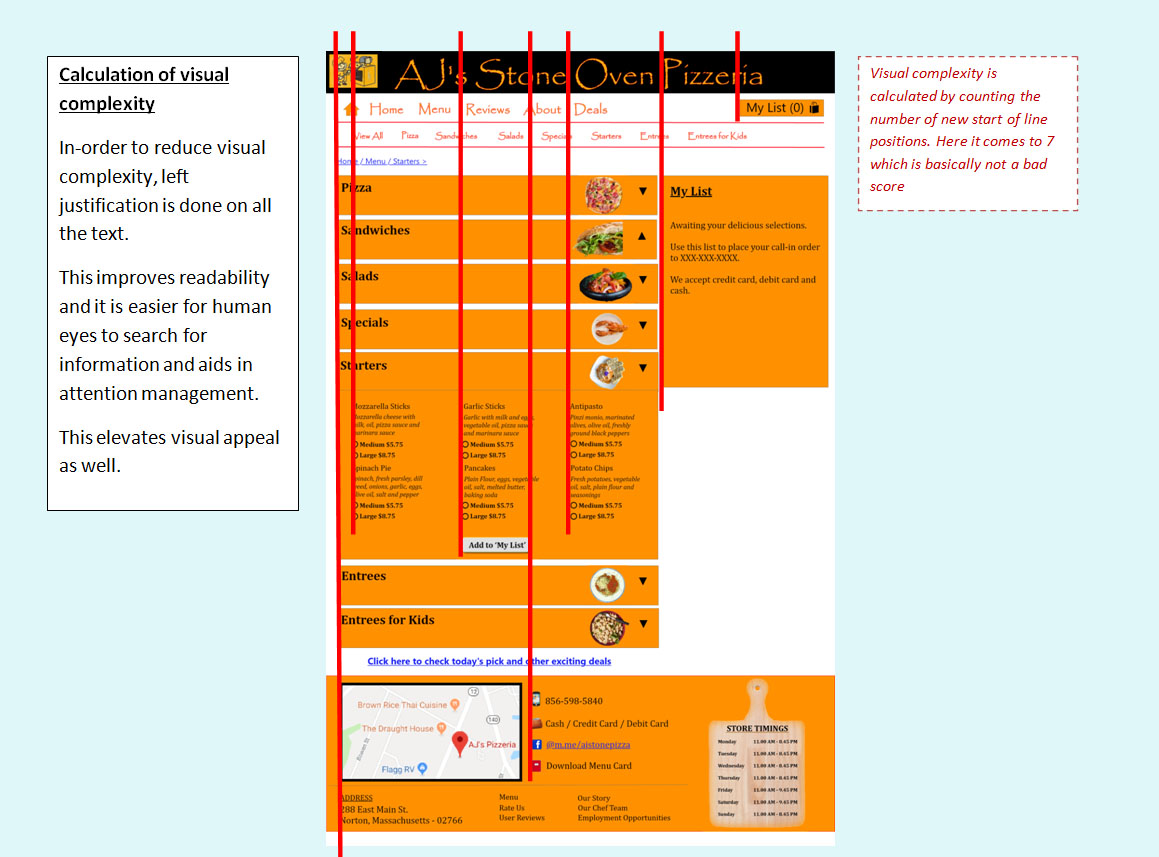
Design Rationale
Adobe XD screens
Below is the video clip demonstrating the user flow, using the website:
Build
According to the process, the resources used in the high fidelity prototype are then shared with the development team for the MVP coding. This high fidelity prototype is also tested for usability and changes inferred from the results are used for further design - test - develop iterations for further releases.
Below is the functional version of the clickable interactive prototype :
