
Amazon UX Casestudy

UX CaseStudy on Amazon.com
Analyzing amazon.com for its compatibility with human factors considerations and user engagement measurement techniques
A short summary of human factors and user experience design
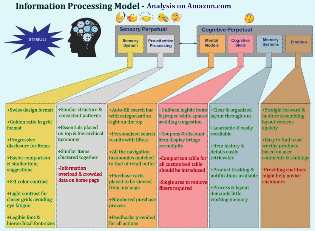
The user experience is a human experience. The human interaction consists of 2 stages viz., sensory perception and cognitive perception. The sensory perception consists of processing information through the sensory system and the pre-attentive processing. The cognitive perception consists of 4 phases of information processing viz., mental models, cognitive skills, memory system and emotional evaluation.
This is a case study evaluating amazon.com, worldwide e-commerce giant, a one stop web app/site that enables the user to browse, search, view product information and finally purchase products online, across these human factors and user engagement measurement techniques.
Human Factors Based Analysis
The design of the e-commerce website is intended as a value sensitive design. It has a well informed design with all the well known conventions and mental model of users fulfilled to a great extend. The services including proper order placement and shipping/return procedures makes the site intuitive for all users which enables it to be a part of people’s everyday life. It fits the user’s expectation and the business goals, hence increasing in growth and number of customers day by day.
The site has gained the customers credibility to a huge extend. The information processing model is also followed, enabling clear and simple detection, retention and recall of information and workflows. The site as a whole appears to be easily learnable and predictable.
Based on the country selected, translated pages with products and deals specific to that particular country are listed which makes perfect sense.[Ref Figure1] The site is responsive and it has a dedicated mobile application that enables all the necessary features in a purchase process, enabling customers to use it on the go.
The site is accessible [Ref Figure 2] and it provides a detailed help guide on the same:


Below is a summarized visualization of the detailed case-study in a nut-shell :
Following are the major principles used for the visualization:
- Gestalt’s principle on a) the graph on placing the markings proximate to the plots b) on the interaction processing model to connect similar properties together.
- Provided colors to items depicting similar or connecting contents.
- Visual structures used are a) linear row structure and color coding for each rows to categorize and group related data together b) clusters to chuck connecting data
- Used a line graph to plot the influence of human factor design on products.
Evaluation based on the ‘Human Sensory System Capabilities'
For less effort to human visual senses, the minimum color contrast is better to be in the ratio of 3:1 and to avoid eye fatigue, closer grids shouldn't be of high contrast. In that aspect, the website is designed with a light colored background throughout which corresponds to elegant Swiss design format with the high contrast black letters to display the various product information in the body copy.[Ref Figure 3] The navigation bar goes with a black background with legible white alphabets.
The font used is legible, professional and clear to interpret. The font sizes are chosen to be hierarchical which help in clear distinction between headings and descriptions.
Each item on a particular category is placed on separate white grids in the body which goes with a light grey background which gives an organized arrangement of items that enables easier browsing and avoids eye fatigue. All the item images are placed on a white background so as to gain more visibility of the product. It also gives high contrast to gain immediate customer focus and attention.


As in Figure 4, the product specification page also follows a common format and information patterns which enhances learnability. The images and videos for that product is placed in the left hand side which would be noticed first followed by the item description, basic details including the prices are placed in the center moving to the right hand side where the ‘add to cart’ widget is placed. Scrolling down gives more information which includes ‘similar items’ or recommendations aiding to more choices and comparison followed by the customer ratings and reviews.
Another important point is that the website layout follows the golden ratio which is aesthetically pleasing to human eyes thereby positively influencing the visual perception. The 'Add to Cart' button is placed right at the place where human eyes tend to easily spot it and this natural ratio aids people to easily understand the layout and find information with minimal or no effort.
Evaluation based on ‘Human Pre-attentive Processing Abilities’
The overall website design clearly implicates a proper structure and establishes patterns in the minds of the users. It is consistent across product pages. All the essentials are placed right in the primary navigation menu. As shown in Figure 5, the ‘departments’ option right in front of the page, details the taxonomy and gives an overall idea of all the various products and categories available in one click.


There is a consistent grid pattern with lesser contrast in color to its background. Similar items are clustered together to form easily searchable groups/categories thus making the design easy to learn and understand.
As seen in Figure 6, the homepage shows various items, categories and recommendations without names or descriptions given right away. The bare minimum information is displayed on various products to reserve the real estate to accommodate lot of products in one horizontal row. This could probably be reduced by introducing a ‘view all’ button that takes the user to a new page listing more of similar products this reducing information overload and crowded data
Evaluation based on the ‘Mental models’
People usually prefer to search whatever they wish for. The most frequently used 'search bar' is placed right at the top. The search is also optimized for exact results and it auto-fills what user types in and the results are personalized. As in Figure 7, the search bar has categories in it which helps to search for an exact match based on product categories. The search bar is prominent on every page making it easier to filter, refine, and view search results in an open and readable fashion.
The various navigation taxonomies are designed in a fashion similar to the architecture of a retail outlet. With this basic store layout experience, people find it easy to navigate through the various departments on the website.
As shown in Figure 8, the shopping process is also made simple and easy by placing ‘add to cart’ icon which can be viewed anywhere from the website at the top right hand side of the navigation bar. People can continue adding items to the cart while browsing through the website and the items in the cart are displayed as a list for checkout. The total amount and quantity are also displayed on the right side bar which aids easy manipulation.


The checkout procedure is laid out in a numbered step by step process which makes it more organized and easy to follow for the first time customers. This numbered process doesn’t annoy the expert users as well since it doesn’t hinder or reduce the speed of order placement by any means.
The return and cancellation procedure is also same as that done at a retail outlet which again matches the mental model. Feedback in the form of tickets and receipt numbers are provided which reduce anxiety of the customers when requesting for a refund.
Evaluation based on the ‘Human Cognitive skills’
The font used is uniform throughout the website which appears to be professional and legible. As shown in Figure 1 and Figure 6, high contrast is used in the font color and image color to gain attention and easy identification. The items in the shopping cart are printed in blue which might cause issues for older customers. But the white background gives the optimal contrast required to distinguish. Proper spacing is provided between lines that doesn’t congest the data. Proper organization in grids for various categories and items are appreciable and aids image comparisons.
The larger sized headings provide a good scent of information right away for the customers. The numbered items in the shopping cart list aids in easy manipulation. The department menu placed upfront in the home page depicts the sitemap and product display structure.
As shown in Figure 9, under each product, there are sections that provide a list of similar items, suggestions and offers, complementary products are displayed, which also brings in serendipity. The same effect is achieved from the homepage where the deals and featured items are displayed. All these increase the likelihood of visitors making a purchase.


As shown in Figure 10, comparison tables are provided for certain items but not for all. It is not possible to customize the products to compare which is a disadvantage. For custom specific items, users have to open multiple tabs for comparison which is a huge issue as far as usability is concerned.
There can be a provision for each product where customers can choose other similar items for easy comparison. The comparison results could be tabular with the major differences and similarities pointed out. An intelligent system can be maintained where each of the products compared are ranked and recommended. This would drastically reduce the purchase time thus hiking the purchase rates.
As shown in Figure 11, the filter options are provided on the left side bar for each category but to clear the search filters, the options provided are too small and scattered which could make it difficult to manipulate. The filter criteria could be specified all together in one area with a remove button on its side so that users can easily go through them and modify accordingly in a much more easier and efficient way.


At times there appears no feedback on the filter and sort option which confuses users. As in Figure 12, the filters in the’ user rating’ section are also not visible and there is a high chance of people missing it. It would be better to place the user review filter option with a larger font size, left aligned rather than on the right side, making it more visible and easy to read.
Evaluation based on the ‘Human Memory systems’
The overall design of the website is pretty much straight forward. For first time users, the item search or browse option is available upfront and the check out process is a definitive step by step numbered process which doesn’t offer much scope for confusion.
The design and site organization is learnable and easily recallable. Click feedbacks are provided wherever possible. Post order placement, receipts and invoice details are made easily retrievable from the orders page. The package tracking facility with mobile messages and email notifications makes it easier for estimating the arrival. The approximate arrival dates are provided upfront at the product page which helps in easier arrangements for collection.
The information architecture and taxonomies provide clear cut navigation to various product pages, order history, re-order page, cart and other highly searched features thus not demanding more working memory.
Evaluation based on the ‘Human Emotions ’
The straight forward and simple design help keep anxiety levels low. The 'free pick-up on returns' is thoughtful in the absence of physical store. The user reviews and rating for each product are arranged in such a way that the trust-worthy comments are placed at the top. This ensures that the product is ranked properly for accurate decision making.
But ‘contacting the customer care’ option is not placed highly visible which can cause anxiety from the thoughts of ‘what if I clicked something and broke the system or lost money’ by first time or occasional users. Customer care numbers or instant chat bots could be added which gains the customer confidence in experimenting and exploring the website more. The more people browse, the more they buy, more the revenue for the company.
The company as an e-commerce giant deserves to win based on its usability and it works on constantly improving the site experience based on the user expectation and their mental models.
User Engagement Measurement and Interpretation
SUS and NPS could be used for an overall evaluation. For example, SUS could be used after each transaction to find how easy it is to use the website for online ordering and NPS to find the likelihood of the user recommending the website, combined with the question ‘Have you recommended Amazon.com in the past 6 months’ for more reliable results.
Kano Model could be used to evaluate additional feature inclusion. For example, including a 24*7 chatbot service could be evaluated based on the metric from the user results and could be considered and prioritized.
Eye Tracking could be used to evaluate how intuitive the website is, for all kinds of users (novice, occasional, frequent/expert). For example, heat maps and gaze plots would make it easy to analyze the ease with which the user searches and finds a product, may it be using the search feature or navigating to the product from the categories. The results determine if an information architecture re-design is required and help find out the peak points of user attention so as to place the main call-to-action items.
LEM tool could be used to check the emotional responses of the users when using the website to measure its aesthetics, usability and liking. It could provide deep insights on specific areas from the website, with the emotion they produce in the user's mind for appropriate re-design.