
Measuring UX

UX Measurement in Online Banking
Quantitative analysis of twinned usability test result data sets of Bank of America and Wells Fargo to measure the user experience
Background and Purpose of study
This project is performed over the twinned usability test result data set of BOA and Wells Fargo to study both the online banking websites based on various user experience criteria. The test determines if the websites meets the human-centered design goals as per the ISO standards: effectiveness, efficiency and user satisfaction.
The data is collected by conducting a study with 84 participants where each participant is provided with 6 randomly selected and ordered tasks out of a total set of 10 tasks. The tasks provided for the study are as listed below:
- What is my overdraft fee?
- Find a statement from one year ago
- What is the fee to withdraw money internationally?
- Transfer money between checking and saving account
- Find the routing number
- Set up Bill Pay
- Change password
- Open a new account
- Set up an alert
- Find the closest ATM
Below is the spreadsheet with the usability test data with the corresponding math performed for detailed analysis and comparison. There are a total of 8 worksheets - task success rate, time-on-task, ease rating, ease-of-finding and visual appeal score, SUS scores, a co-relation calculation sheet, z-scores calculation and finally the overall comparison data. Each worksheet has data of BOA and Wells Fargo listed side by side.
Below are the terminologies, metric and formula referred in this project
- The symbol 'n,' represents the total number of individuals or observations in the sample.
- The sample mean is the average score of a sample on a given variable and is represented by:
x_bar = ( Σ xi ) / n where x_bar is the mean and xi is the data from the sample - The sample standard deviation, is a measure of the spread (variability) of the scores in the sample on a given variable and is represented by:
s = sqrt [ Σ ( xi – x_bar )2 / ( n – 1 ) ]
where xi is the data from the sample and x_bar is the mean - The sample variance is the square of the sample standard deviation and is represented by: s2 = Σ ( xi – x_bar )2 / ( n – 1 )
where xi is the data from the sample and x_bar is the mean - The confidence interval gives an estimated range of values which is likely to include an unknown parameter, the estimated range is represented in excel by : = CONFIDENCE(alpha, s, n)
where alpha, is often .05 (for a 95% confidence interval) and s is the standard deviation of the sample - The confidence level is the upper and lower limits of the confidence interval represented by :
Upper limit = mean + 95% confidence level;
Lower limit = mean - 95% confidence level - TTest is used to compare means of 2 data set represented in excel by: = TTEST(array1, array2, x, y)
where x = 2 (for two-tailed test) in almost all cases [ In one-tailed test, one site 2 can be > or = site 1], y = 2 (independent samples – between subjects), y = 1 (paired samples – within subjects) - The time data is cleaned up by eliminating outlier in the scatter plot and using the quartile method :
Low outlier = 1st quartile – 1.5 * difference;
High outlier = 3rd quartile + 1.5 * difference - For Likert scale data, top 2 and bottom 2 box scores are calculated by considering top 2 scores as high and bottom 2 as low to analyze quantitatively
- Correlation looks at the relationship and association between two variables represented in excel by: = CORREL(array1, array2)
where the arrays are the data set from the sample - z-scores helps combining metrics that have different scales for easier comparison represented by: = STANDARDIZE (xi, x_bar, s)
where xi is the value from the sample to be standardized, x_bar is the mean and s is the standard deviation
Task Success Data
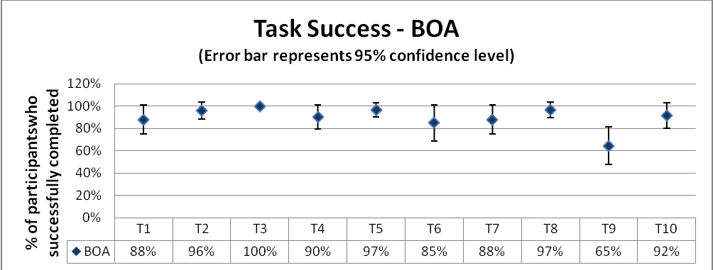
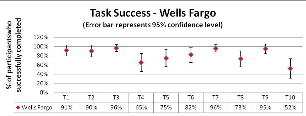
Process: From the task success/completion data collected, the mean completion rate and the confidence interval with a confidence level of 90% is calculated. A graph is plotted with the mean percentages against the success rates with an error bar based on the confidence interval.
From the graph, it is clear that for tasks# 1, 2, 3 and 6 both the banks provide more or less similar success rates. However, there are significant differences in completion rates for tasks 4, 5, 7, 8, 9 and 10 between the websites.
Wells Fargo does significantly better in task# 9, to set up an alert where there is a difference of 30% in the performance as compared to BOA. Except this task, for all the other tasks, BOA proves better, especially in task#10, to find closest ATM where BOA exceeds Wells Fargo way ahead with a hike of 40%. The confidence interval for BOA is smaller as compared to that for Wells Fargo which indicates that the interpretation would be consistent across studies.
Overall, for task success BOA stands significantly ahead of Wells Fargo on this scope.
Task Time Data
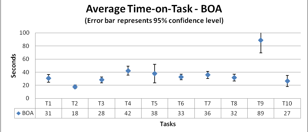
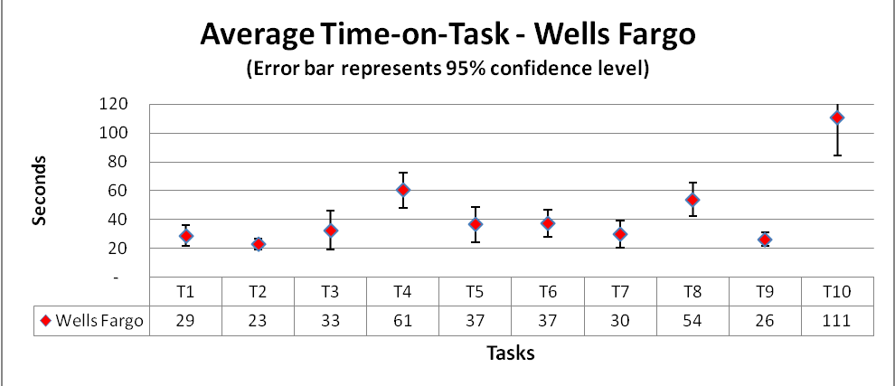
Process: The time data obtained from the study is cleaned up by removing the outliers using the quartile method. The higher and lower outlier limits are calculated for each task across both the websites time data and all the values above and below the outlier bounds are removed.
The median of the cleaned up data is calculated which reduces the effect of the remaining outliers if any and a graph is plotted with the median values across the time on task with an error bar based on the confidence interval calculated with a confidence level of 95%.
From the graph, we can infer that for tasks# 4, 8 and 10, BOA is significantly more efficient which includes, transfer money between saving and checking account, open a new account and find closest ATM. Whereas, Wells Fargo proves to be more efficient than BOA in tasks# 7 and 9 which includes, changing password and setup and alert.
However for all the tasks in general, BOA stands ahead of Wells Fargo even if it is just marginal difference. The error bars also implicate wider intervals for Wells Fargo as compared to the intervals for BOA which again says that the results would remain consistent across evaluations.
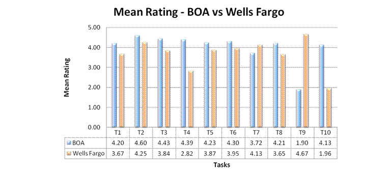
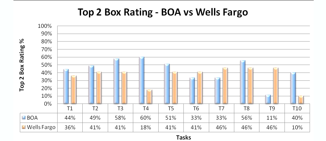
Task Ease Ratings
Process: From the task ratings data, the top-2-box ratings for each task are calculated. Including the top-2-box approach gives a gist of overall ease rating across each task which helps in setting task improvement/fix priorities.
A combination graph is plotted with the mean rating and top-2-box rankings across each task for both BOA and Wells Fargo for easy comparison.
The mean rating graph says that except for task#7 and 9, changing passwords and setup an alert, the ratings are fairly higher for BOA as compared to Wells Fargo. Overall score for BOA stands close to 4.5 which is a good overall rating for a website.
On the other hand, the top-2-box rating graph gives the maximum ratings not more than 60% for either of the websites, out of which tasks#3, 4 and 10, BOA stands way ahead of Wells Fargo which exceeds BOA significantly for task#9. Overall rating from the participants on comparison goes to BOA as per this study.
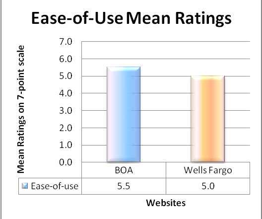
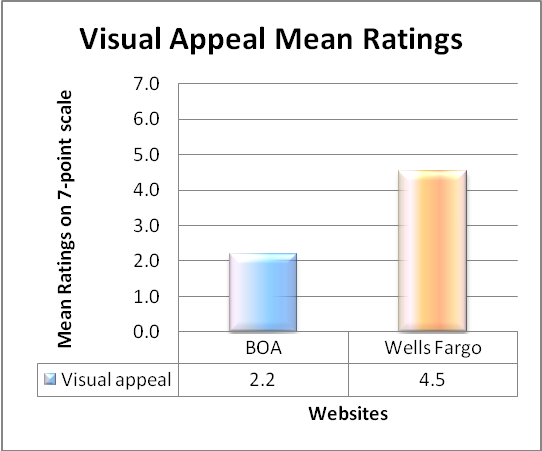
Ratings of “Ease of Finding Information” and “Visual Appeal”
Process: The ease of finding and visual appeal data is the overall rating collected out of a scale of 1-7, with 7 being the best score.
The mean of ratings are calculated and is plotted against both the websites for analysis.
From the ease-of-use graph, BOA stands marginally higher than Wells Fargo and as for the visual appeal, Wells Fargo stands way ahead than BOA. The ease of rating as well as visual appeal of Wells Fargo stands more consistent with mean ratings of 5.0 and 4.5 than that of BOA with ratings of 5.5 and 2.2 respectively.
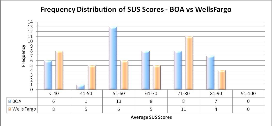
SUS Ratings
Process: The overall SUS scores are calculated from the data across 10 studies. The frequency distributions are then computed along with the mean of the percentiles. A graph is then plotted with the average SUS scores against the frequency distributions of both websites.
From the SUS score graph, BOA has obtained 13 scores in between 51-60 which is good and only 6 scores below 40 who are the possible ‘detractors’. While Wells Fargo has 11 scores in between 71-80 which is good and it has 8 scores below 40 who could be categorized as the ‘detractors’. BOA has 7 promoters while Wells Fargo has only 4 promoters.
Comparatively, the overall ranking based on SUS is more supportive to BOA than Wells Fargo in terms of promoters.
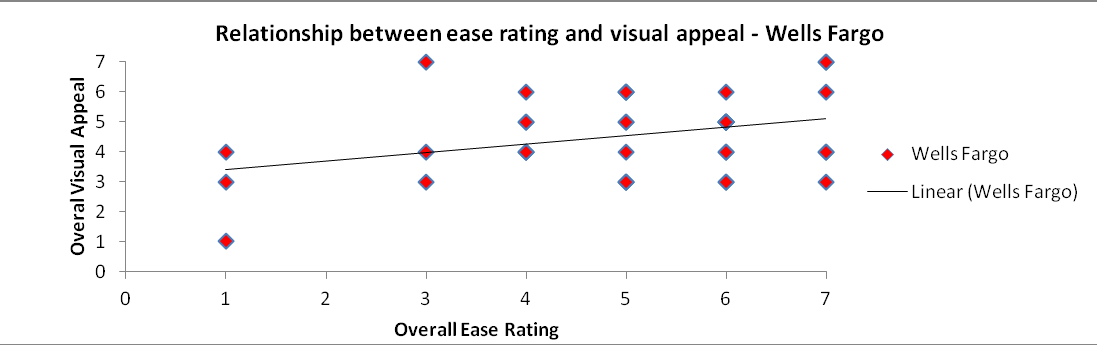
Relationships between variables – ease rating Vs visual appeal
Process: The correlation coefficients of BOA and Wells Fargo are calculated for the ease rating and visual appeal and a scatter plot is charted.
Both the scatter plots convey that there is a direct linear relationship between the ease rating and visual appeal. The ease rating is higher for those with good overall visual appeal rating. Hence it is reasonable to consider the visual appeal in order to increase the overall ease rating.

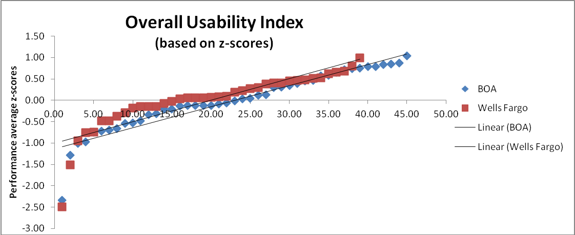
Overall Results
Process: The average time-on-task, task success and user rating is calculated from which the z-score ratings for each are derived. This normalizes all the 3 scores and finally the mean of all the 3 z-scores is calculated and a graph is plotted to compare the overall performance of both the websites.
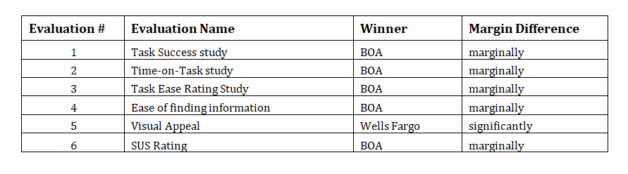
All the test results are summarized in the table below :
Overall, it can be seen that there is no significant difference between the online user experience offered by BOA and Wells Fargo at a confidence level of 95%. It can only be interpreted that BOA scores marginally higher and therefore has a higher overall usability index.